


Designing a visual identity for a company
that helps businesses save energy
The Challenge
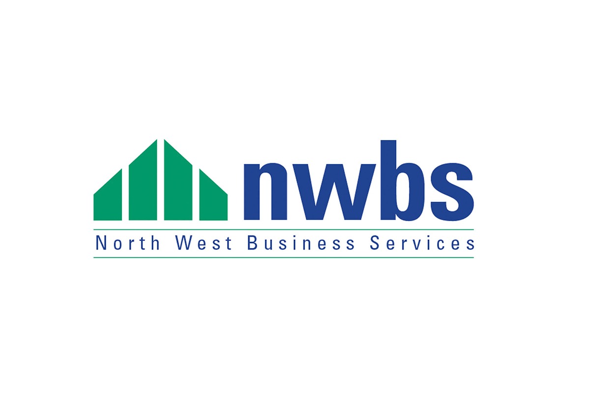
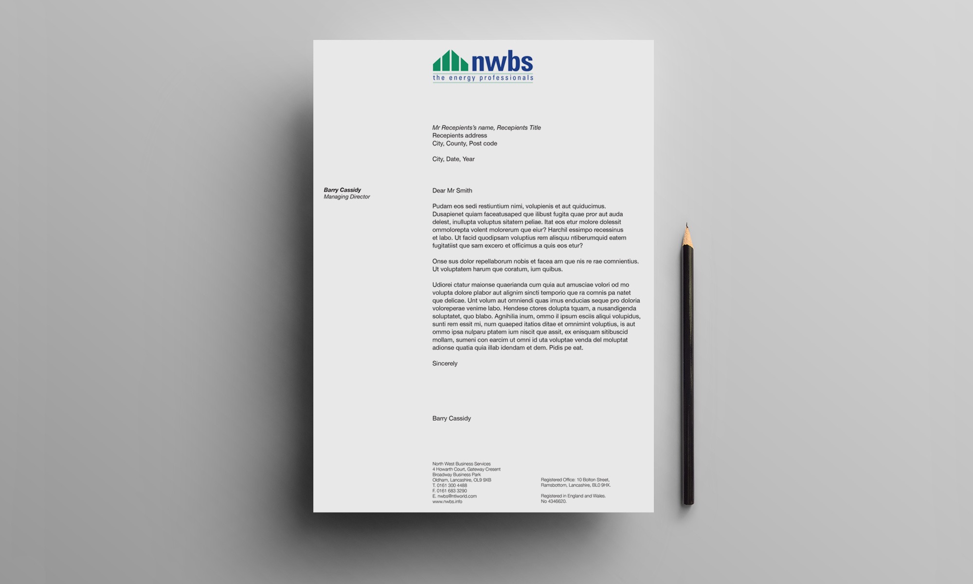
NWBS the energy professionals needed a visual identity. Designing a visual identity for a company that helps businesses save energy and therefore reduce it's harmful impact on the environment.
The Solution
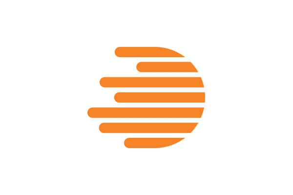
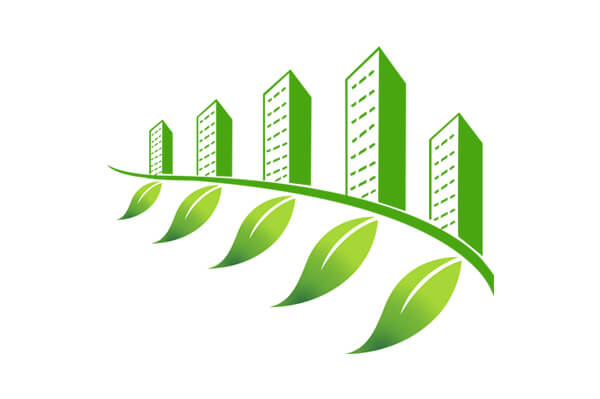
With a considered layout, a “building shaped” emblem is formed using a grid. The 'building shape' is green to reflect energy saving. shape of the symbol has been kept purposefully simple in order to aid fast recognition and to allow for reproduction at all sizes without loss of detail.
Results
The all new NBWS 'building shape' logo design is distinctive, appropriate, memorable, practical and simple in form. It conveys the NBWS's intended message, as well as being able to work digitally and be printed at any size while remaining effective without color needed.
Feedback
'Suzanne is a very focused and creative individual with a great eye for detail. Imaginative yet practical, she knows what will and won’t work in a wide range of applications. Can thoroughly recommend her.'
- Barry Cassidy
Managing Director at North West Business Services