


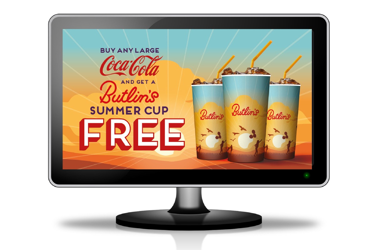


Packaging and Marketing Materials design for Coca Cola and Butlin's
The Challenge
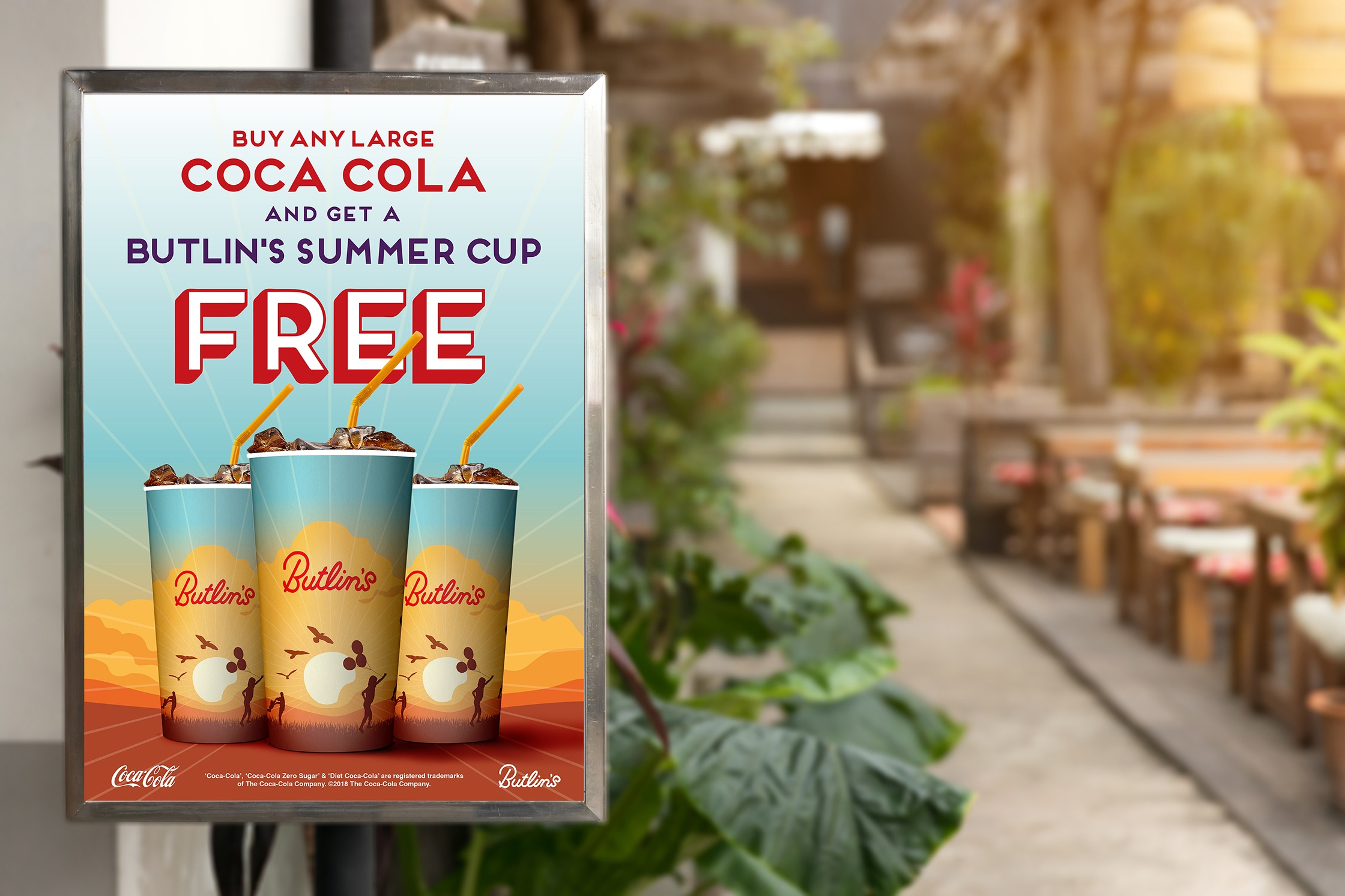
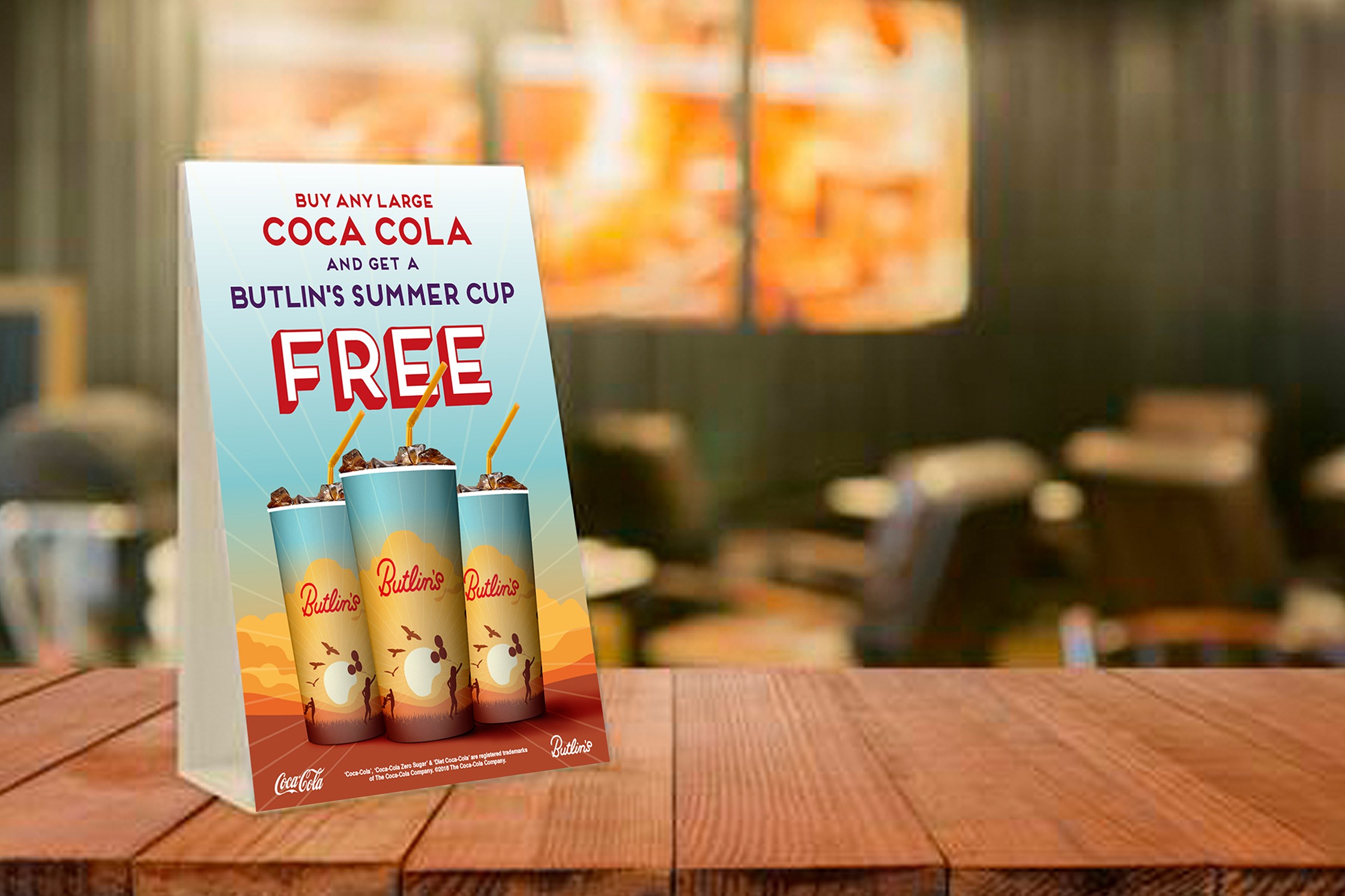
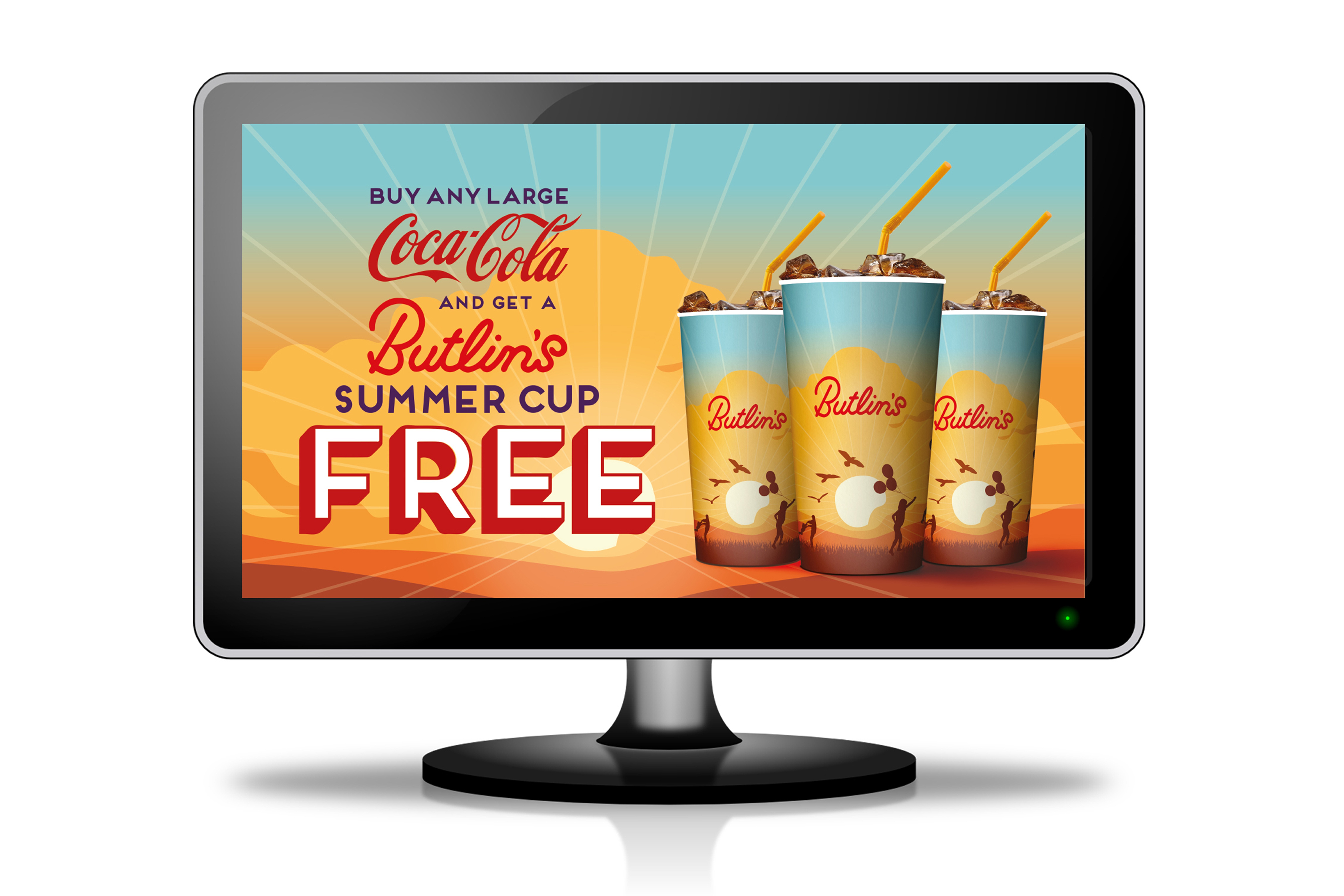
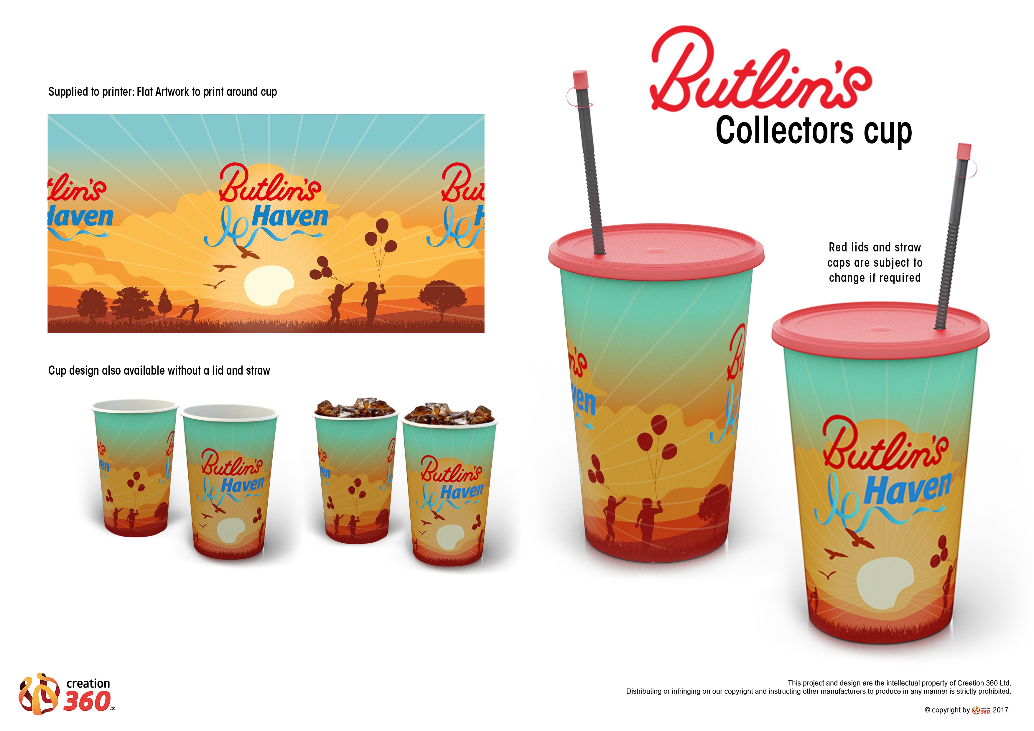
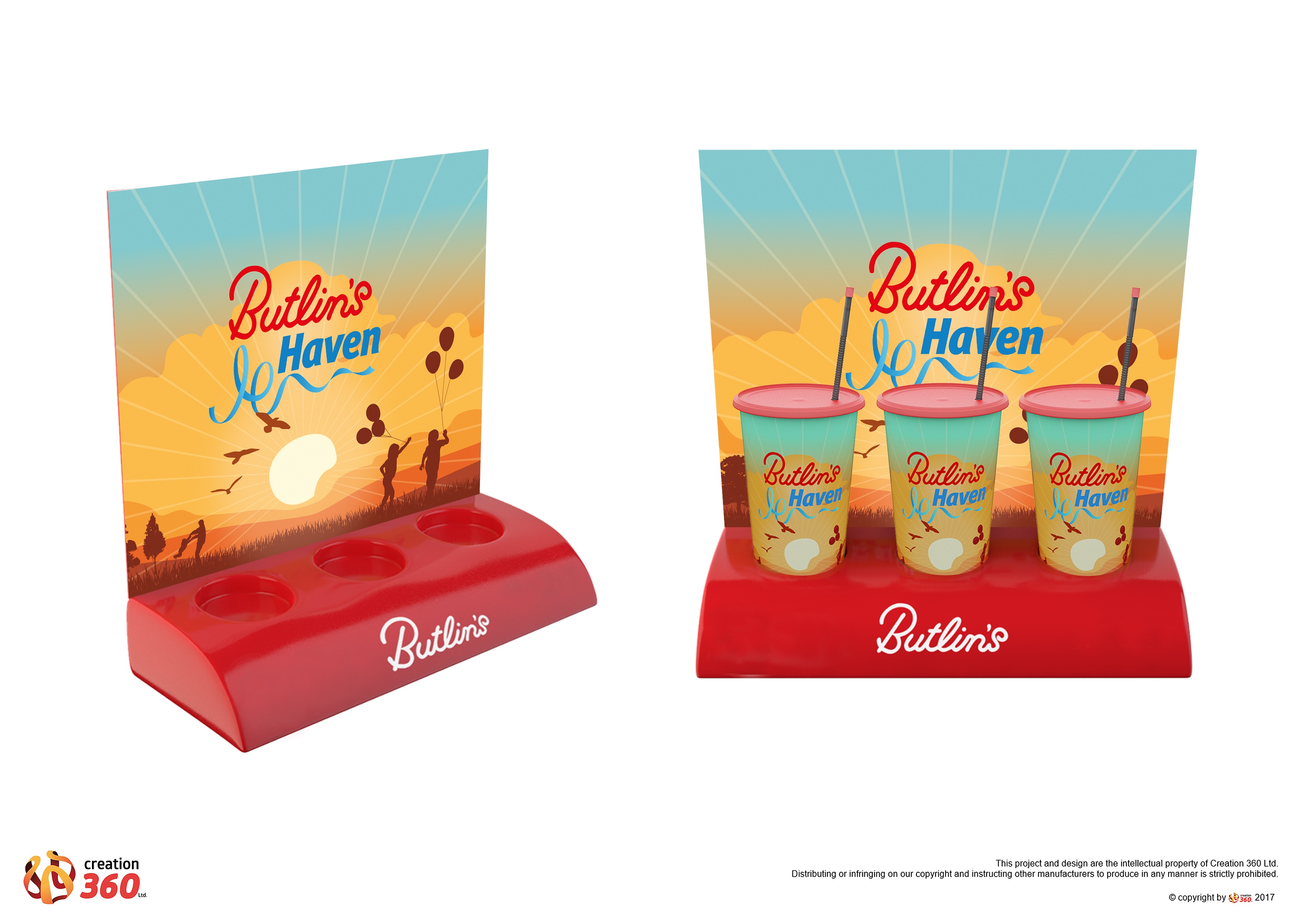
Butlins and Coca Cola needed a new fresh summertime design for their Coca Cola cups. Reflect their family fun for everyone values.
While working as a design at the creative packaging and merchance company Creation 360 I was asked to design this packaging and promotional adverting for a new Butlin's summer cup design and Coca Cola promotion.
It needed to be bright and family friendly and reflect the values of Butlins. The Butlins personality led drinks brand that leaps off the shelf.
Design is a key factor in packaging. A quality package design can attract potential customers and set the product apart from the competition. The visual presence represents not only the quality of the product, but should also suggest a clear personality – whether it be quirky, authentic or charming.
The Solution
The most prominent part of the packaging is the 'Butlins' brand name, followed by a changeable family holiday-themed image to add flexibility as the cup designs change for each offer.
I used warm and friendly illustrations to create this packaging design. I also kept in keeping with Butlins brand guidelines by usng their retro 1950s style of font which gives the design a contemporay yet nostalgic feel.
The powerful use of illustration communicates the fun, happy relaxed Butlins feeling with attention-grabbing power, on-shelf and on Instagram.
Results
This design attracted customers and set the product apart from the competition. The visual presence represented not only the quality of the product, but also suggested a clear charming and friendly personality.