


Graphic design and illustrations for the General Medical Council
The Challenge
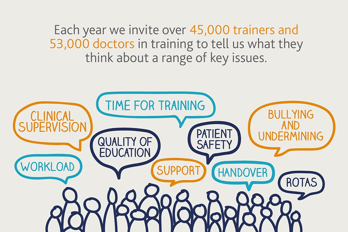
The General Medical Council work to protect patient safety and support medical education and practice across the UK. They do this by working with doctors, employers, educators, patients and other key stakeholders in the UK's healthcare systems.
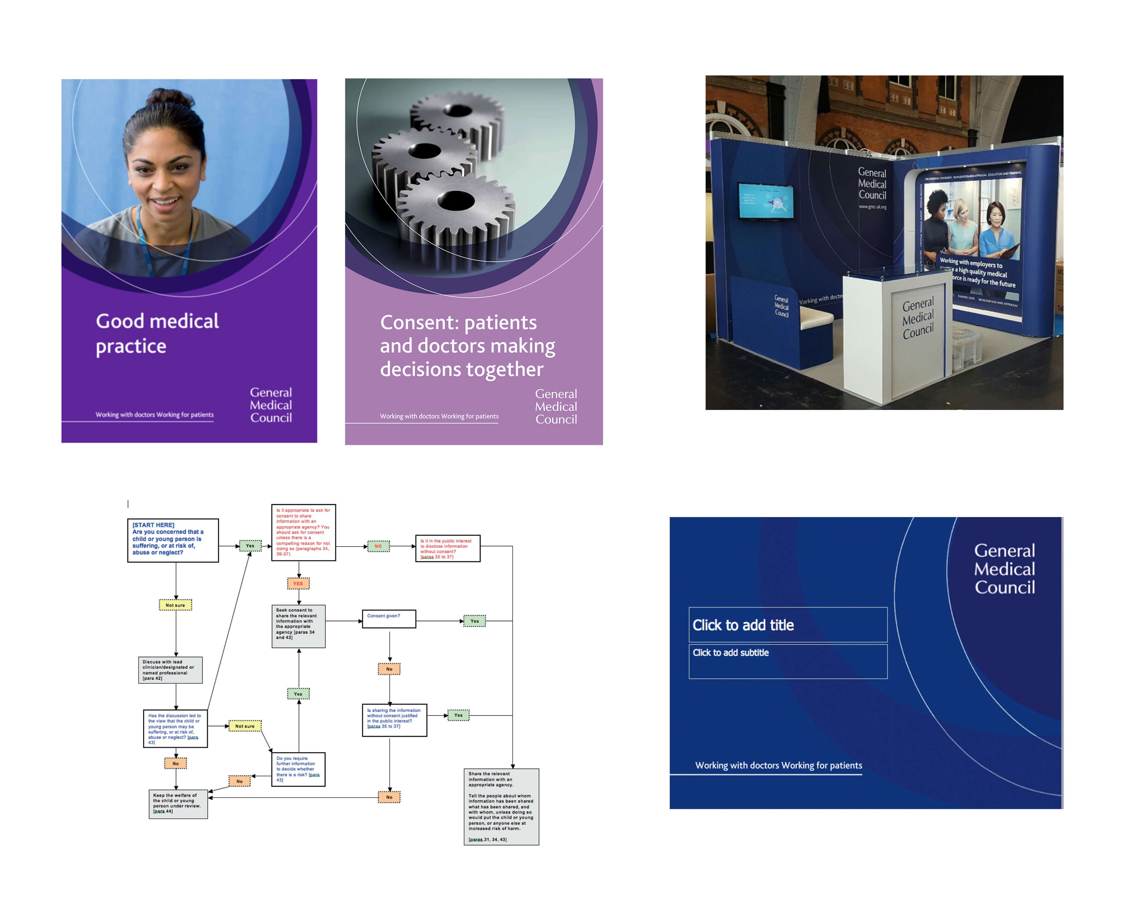
While I contracted as a digital and graphic designer at the The General Medical Council as part of the Digital Transitions team I was asked to refresh their external and internal digital/print marketing materials along with information graphics. Even though the GMC is an authority and sets the standards for doctors they also have a supportive role. Research had found that their current marketing materials were too clinical, corporate and in some cases the graphic design lacked consistency and did not have a professional finish. The internal communications team also required new and innovative ideas and wanted their designs to be 'bold and bright' to reflect the attitudes of the employees.
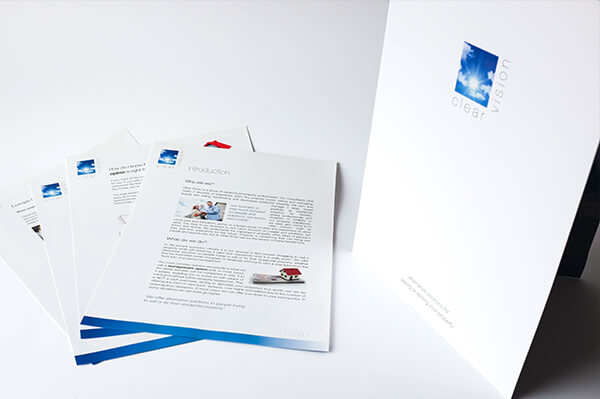
A few examples of the GMC's marketing materials and information graphics before the change
The Solution
While working as a graphic and digital designer at the GMC I worked closely with a number of teams and identified the following needs:
• Project the image of a modern, forward-looking organisation, appropriate to values and audience requirements.
• Strengthen and promote key messages of trust, solidity, neutrality.
• Show support for doctors and patients.
• Be distinctive
Design of a new aesthetic for GMC icons, diagrams and illustrations
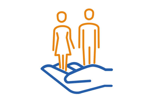
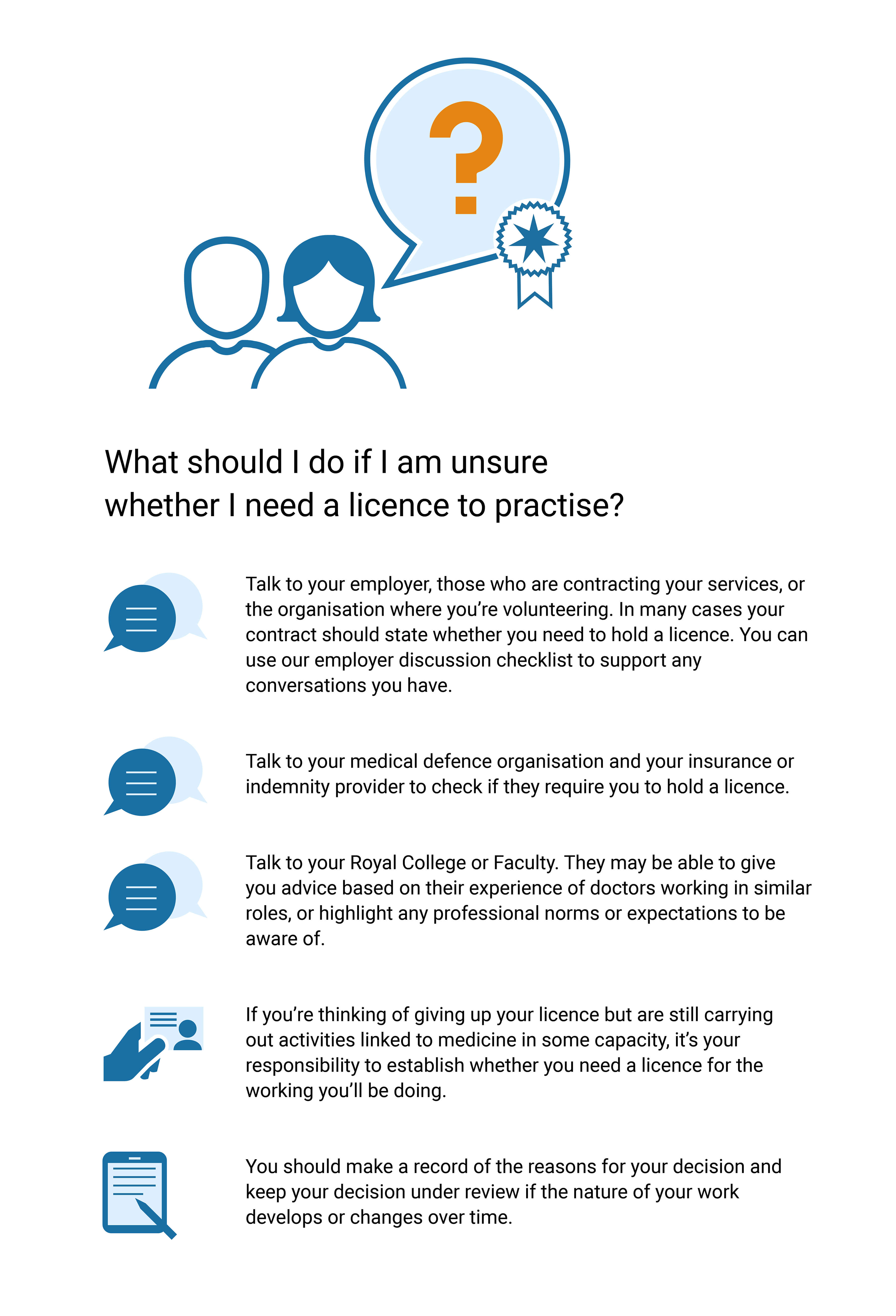
I was asked by the digital transition manager to contribute to the GMC website interface by designing a number of icons, diagrams and illustrations to help guide doctors that were to be accessed in the support pages of the GMC website and in a printed report. I was told that the icons needed to communicate the feeling that the GMC supports doctors therefore I designed them in way that was friendly, human and approachable.
I used thin elegant lines, pastels and rounded corners to make serious tasks feel welcoming and supportive. Like most good icons they also needed to be easily understood, recognisable and designed using the company brand guidelines. Icons are also a great way to save space and they make good touch targets especially when used on mobile.
GMC website decision tool icons
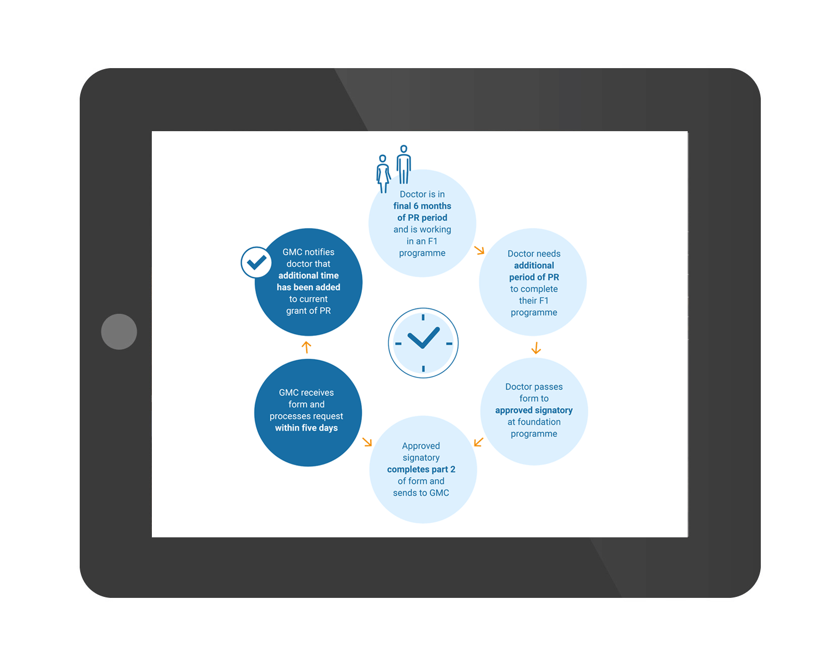
I was asked to design a set of icons for the GMC website's decision tool that guides doctors through a number of important decision making processess.
Revalidation Icons
These icons were created to differentiate the guides to revalidation for doctors at different points in their careers.
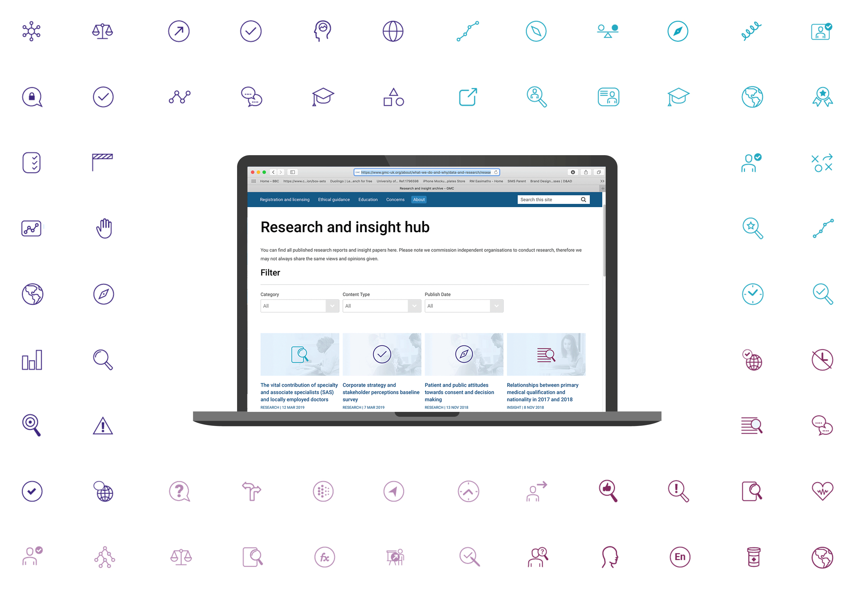
GMC research and theme icons
A cohesive set of icons were required for the research archive section of the GMC's website to help the user to differentiate between each of the items. The thumbnail images that displayed each item were also colour coded and subtle photography was used so that the user can easily identify each of the four categories.
Illustrations for GMC news page items
Ths image shows a few of the illustrations I created for the news page items on the GMC website. It was important that the thumbnail images engaged audience so that they would read click on and read the stories.
GMC icons and Illustrations
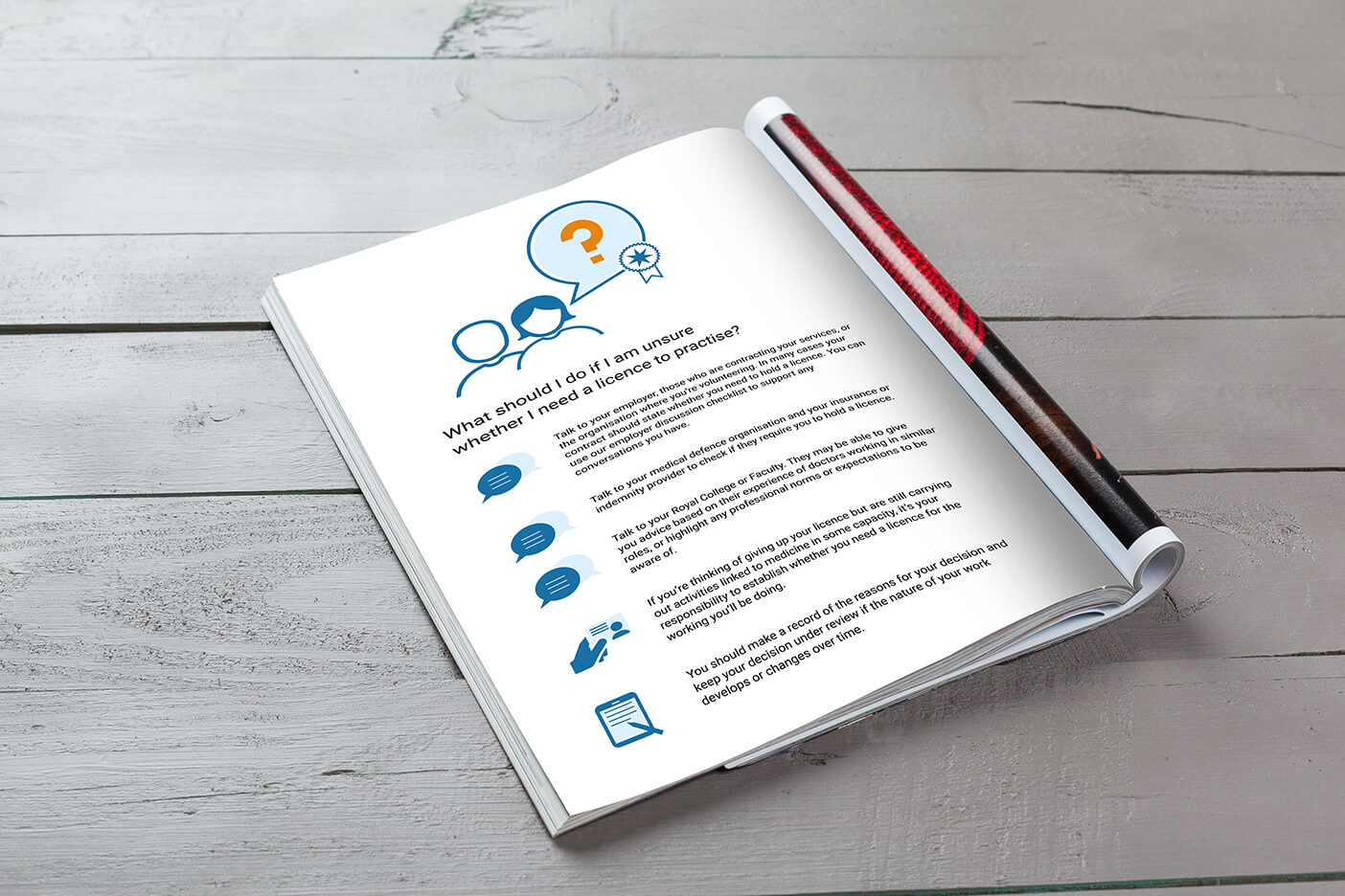
More examples of icons and illustrations that I designed to guide doctors through a number of processes. These were used for printed reports and made available to download on the GMC website.
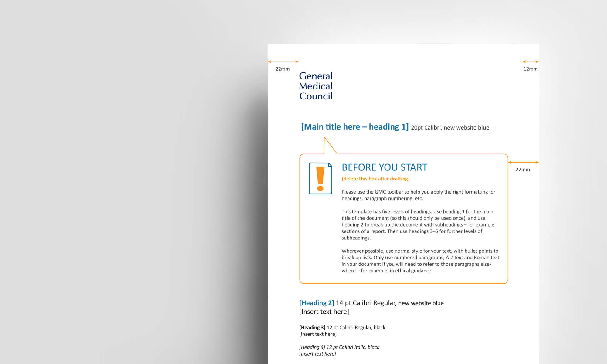
GMC Word Document template design
This is a word document template I designed containing an illustrative icon for the GMC so that teams can have their own template to create documents that contain the new GMC aesthetic. This helps to make all documents consistent and recognisable as a GMC document.
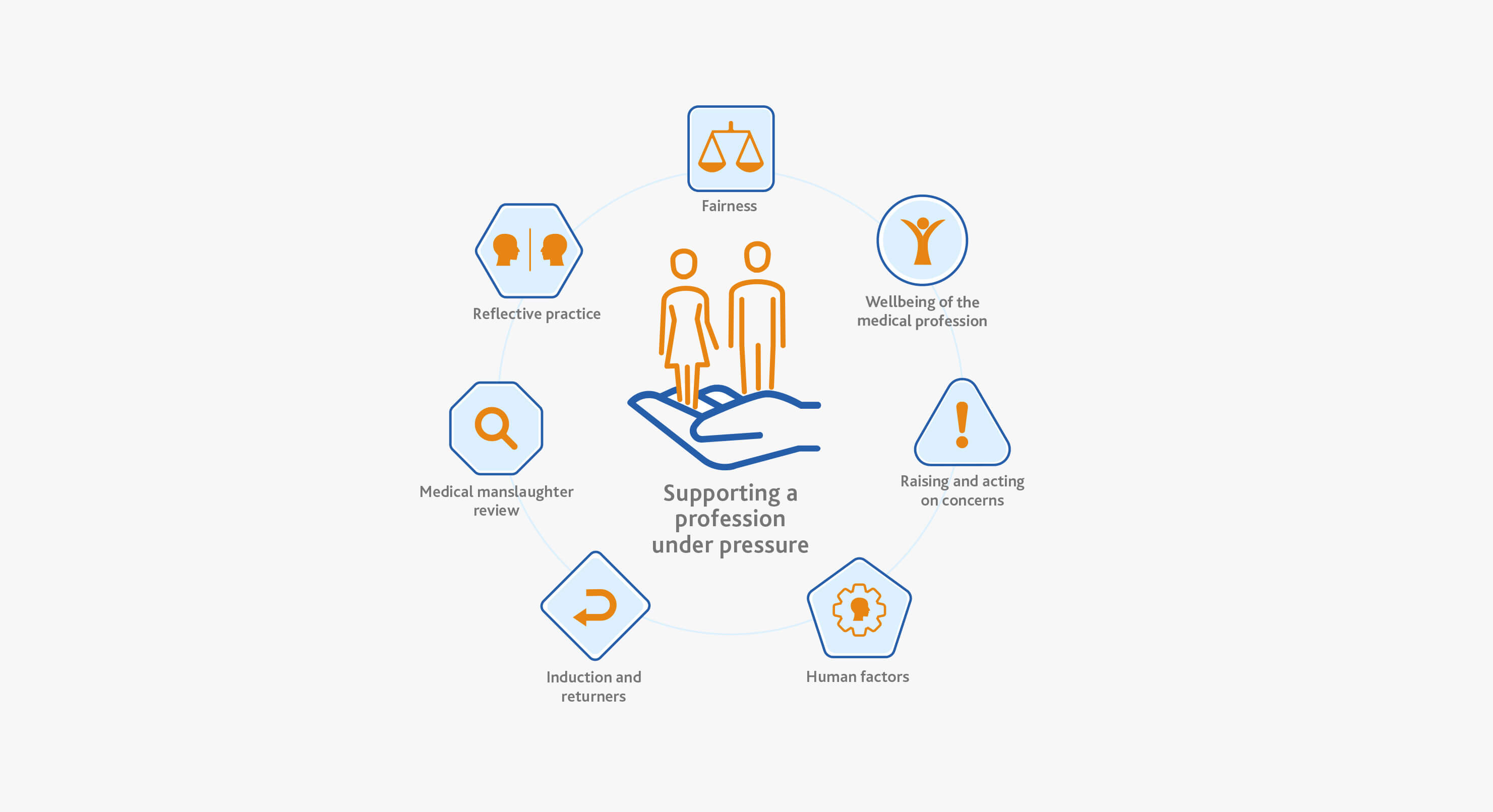
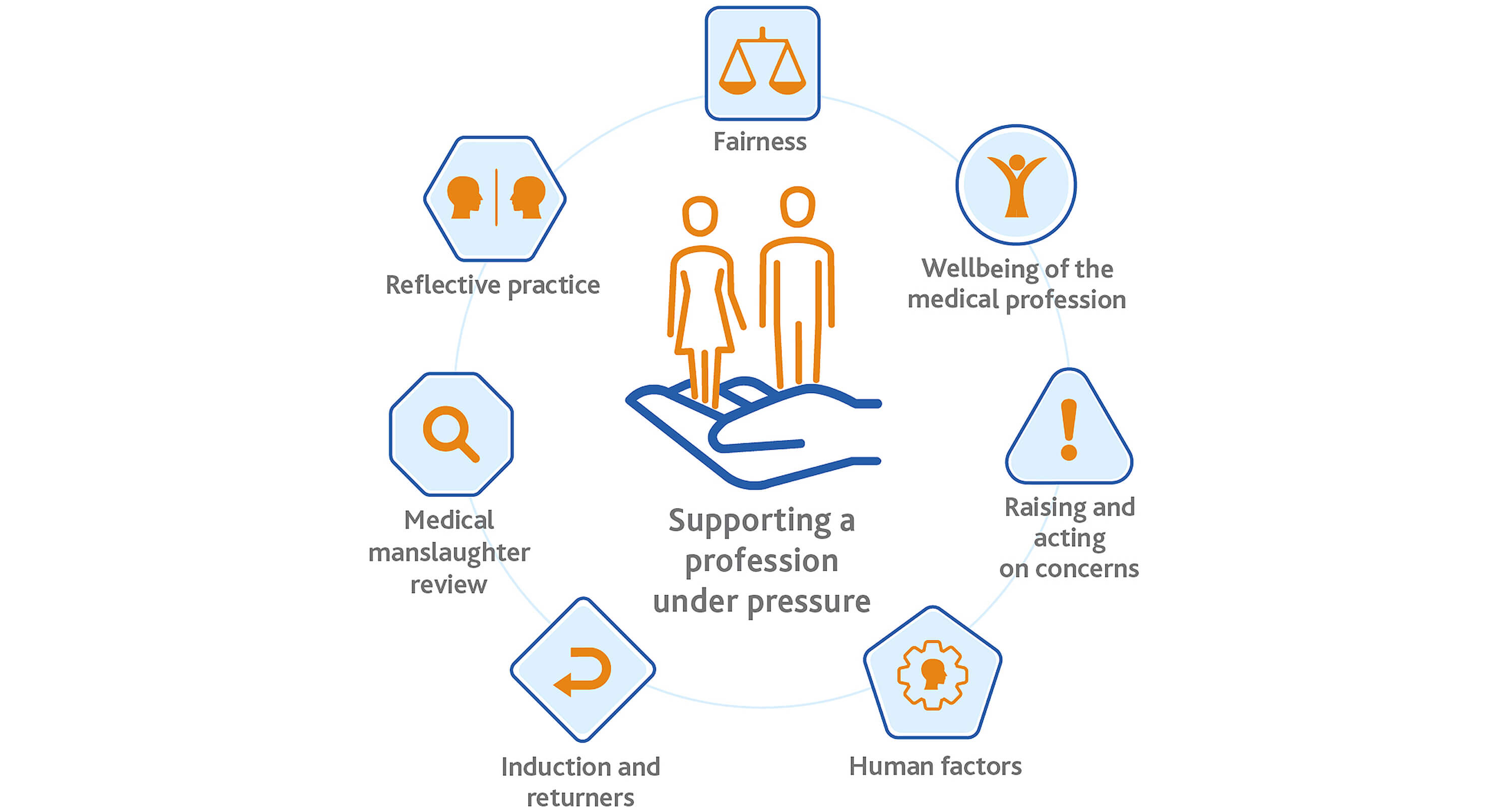
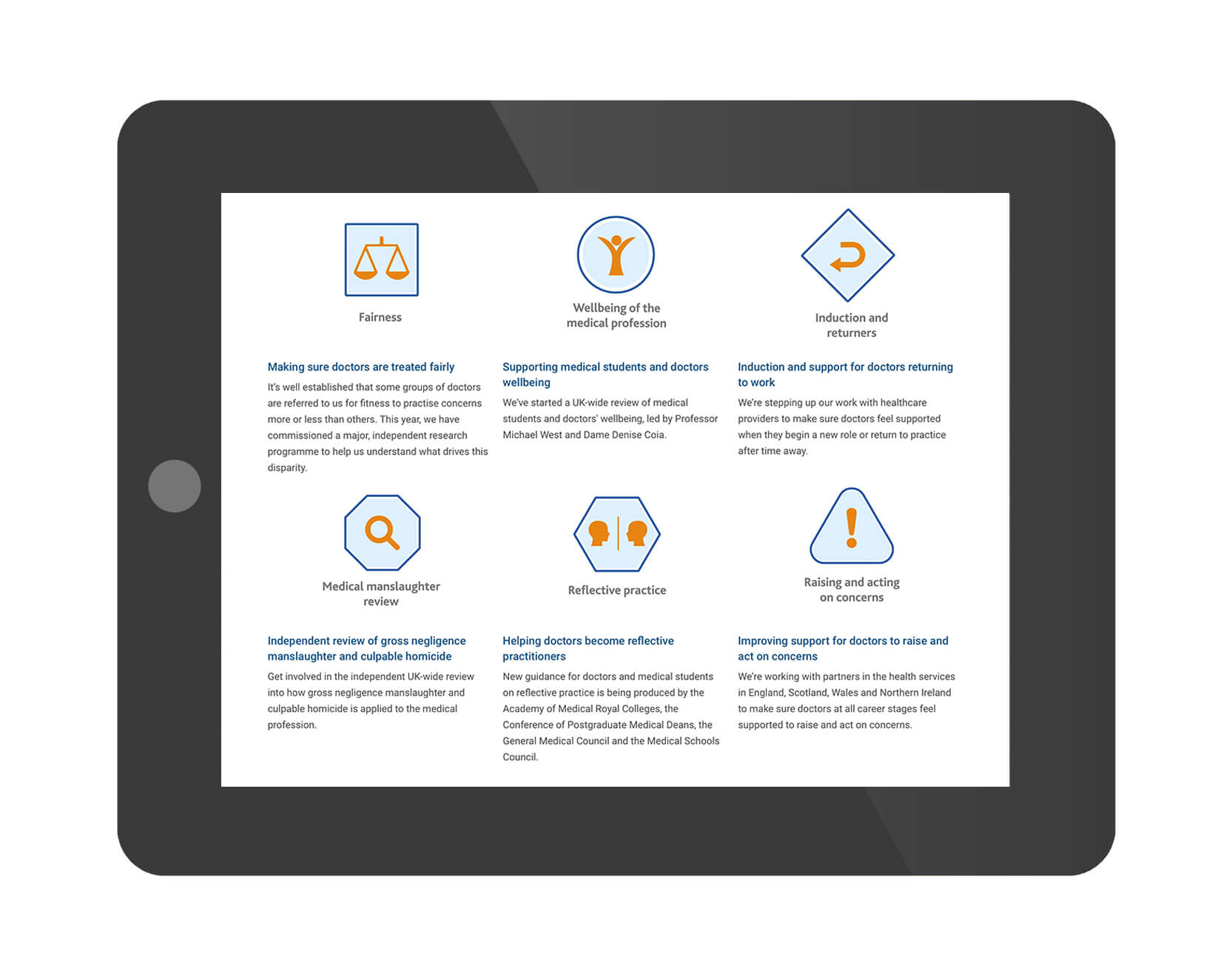
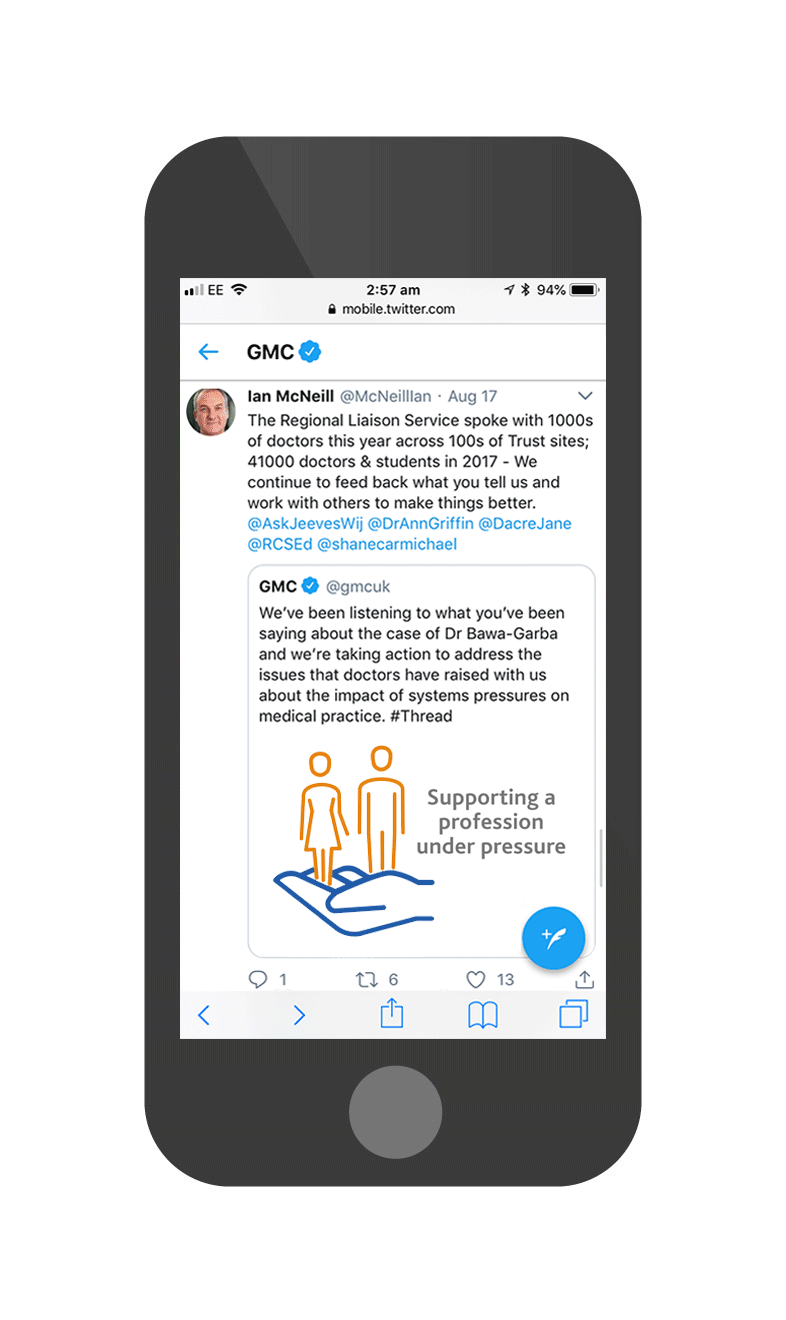
GMC support illustration
This is an infographic that I helped to design to symbolise how the GMC is taking action to address the issues that had been raised with them about the environments in which doctors work, and the impact of systems pressures on medical practice. This was a quick response design created at the end of a court case involving a doctor that was found to cause a great deal of stress to doctors.
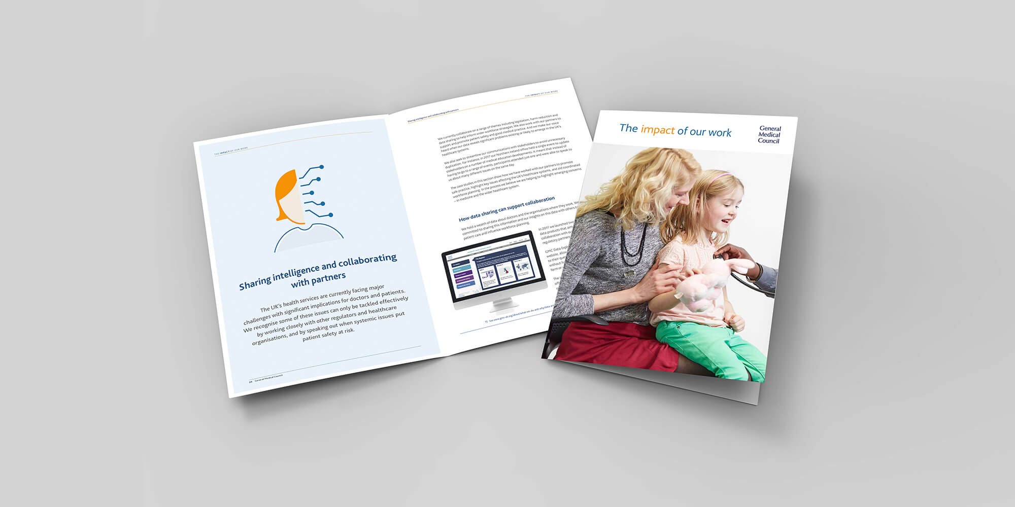
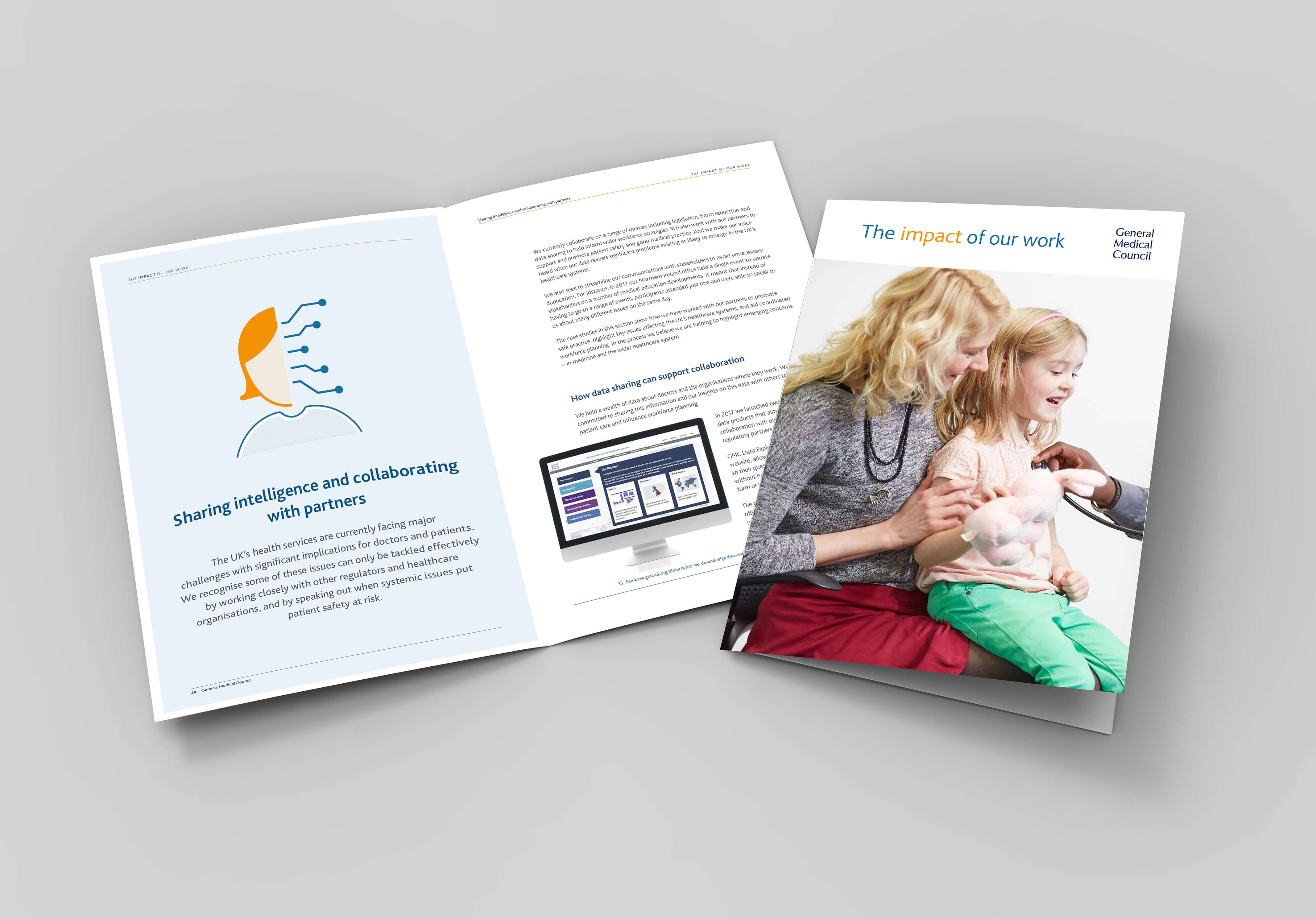
GMC Impact report
In this GMC impact report I art directed an in-house designer to use a combination of 'GMC style' illustrative icons designed by myself and a selection photographs that had been taken at a commisioned photoshoot of doctors in their working environments working with patients, to highlight real life case studies and examples of how the GMC works to support doctors and protect patient safety in the UK.
I created the illustrations to unify the report design and create a human look, feel and mood while taking the reader on a journey through the report. With a touch of creativity, a report can become a treat for the eyes.
The teams and I felt that people would benefit from seeing photos of doctors and patients because they tell a captivating real life story and that this type of lifestyle photography will help to humanise the GMC.
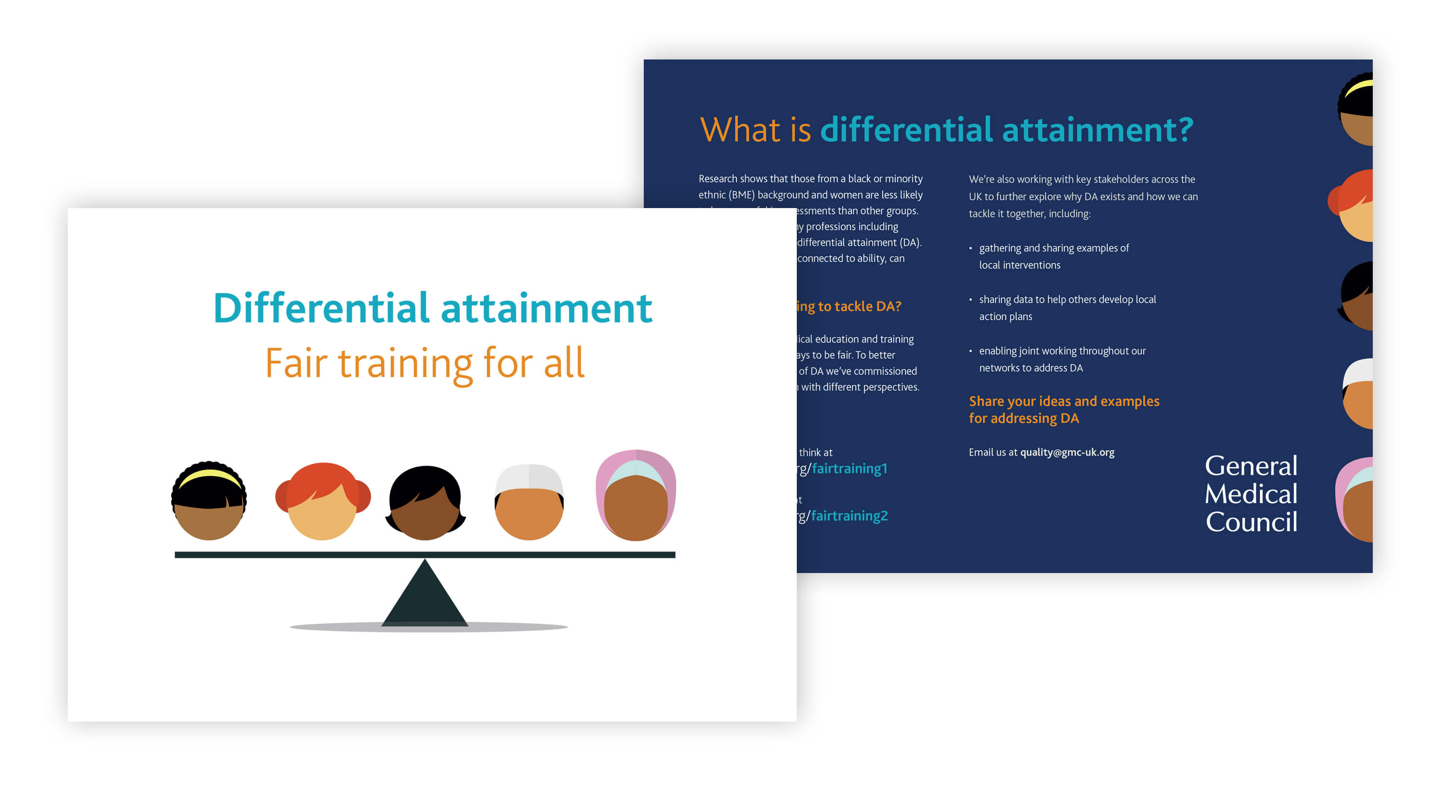
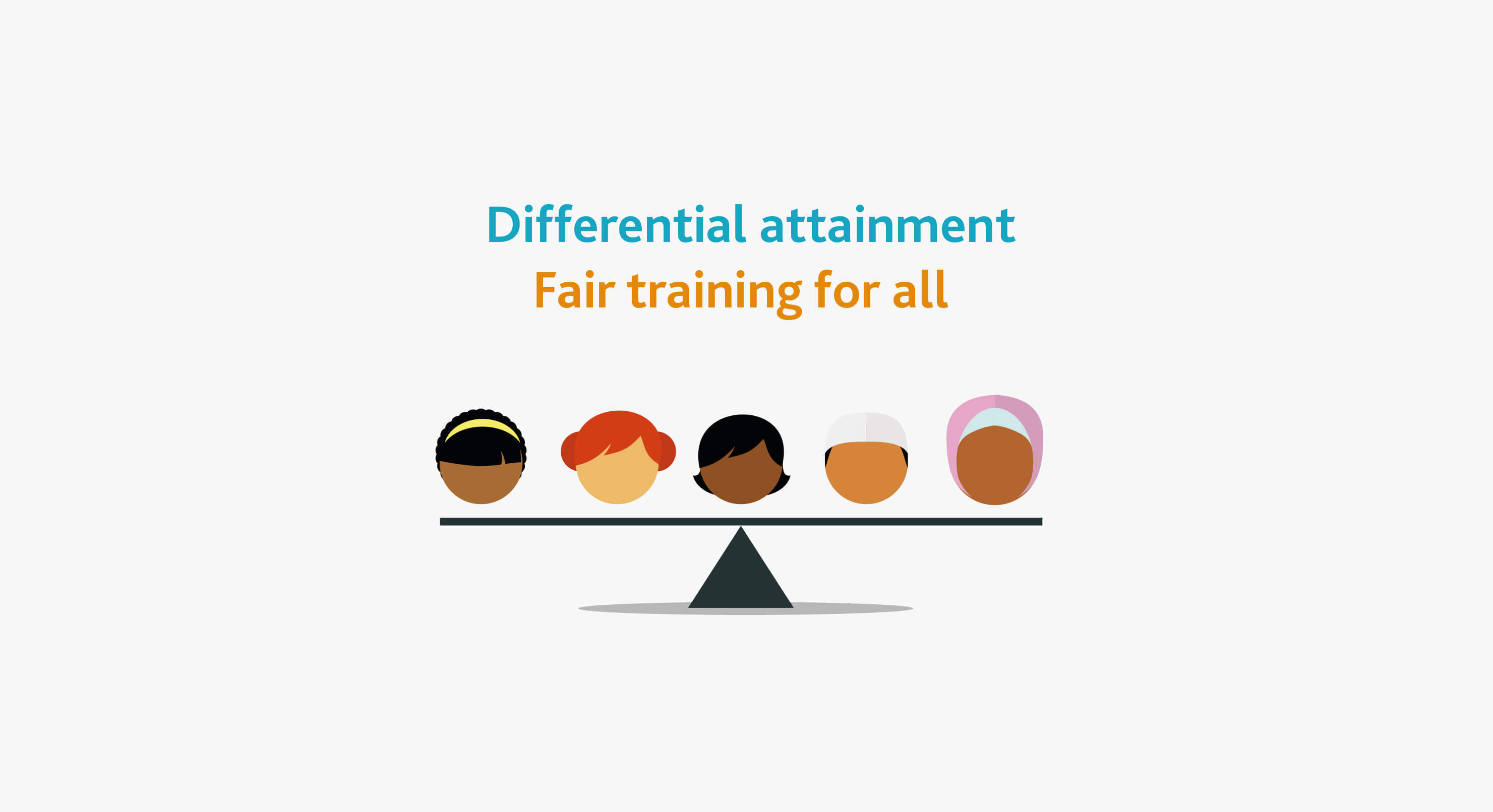
GMC Differential Attainment Postcard
Research shows that those from a black or minority ethnic (BME) background and women are less likely to be successful in assessments than other groups. This occurs across many professions including medicine and is called differential attainment (DA). This is a postcard I created that was handed out at a GMC event to give information about what the GMC is doing to tackle DA.
The campign manager and I felt that this concept-led approach was colourful, strong, simple and visually arresting, which helps the postcard stand out from a crowd of other bland, clichéd and typically corporate looking postcards. We also felt that the cute cartoon symbols help to place the GMC on a level with everyone that in turn helps to make the GMC approachable and gain people’s trust, instantly improving communication.