Selected Logos
"...the challenge of communicating layered messages through minimal form.
A logo can be visual poetry." - graphic designer Lance Wyman
I create effective visual identities...
for businesses of various sizes, that are engaging, relevant and usable. I believe in the bigger picture, where a company’s story can be told in an honest and consistent way across all platforms and media.
Although a logo is just one part of a brand identity, I decided to collate my favourite ones from the past few years in one place. If you would like to see how some of these logos work in context across different platforms take a look the visual identity projects in my porfolio.

MPTS. The Medical Practitioners Tribunal Service logo is clear, simple, memorable and appropriate to values and audience requirements.
Palamatic. I made this identity icon into a 3-D animated object to reflect Palamatic's dynamic engineering solutions.
Digital Pace. This logo was designed in a modern dynamic way to reflect how Digital Pace provides professional independent strategic business advice to help companies make the most effective use of technology.
M1 Health. Designed to reflect the health and vitality improving values of this personal training, corporate and private health consultancy.
William Josef. This male grooming salon offers traditional artisan services while being modern and technology forward.Therefore I created a pastiche logo inspired by luxuorious cigar packaging. I used a stong bold 'Wild West' style font to show confidence and, a gold oval badge and gold trim all to give the logo a high end look and feel.
Green Years. I designed this logo to reflect how this estate agent promtoes caring for the environment and their clients own wellbeing by living in green spaces
NBWS. The logo is clear, simple and straight to the point which reflects the honest approach NBWS have towards energy efficiency. It is also clear to see from any signage used outside of the office.
Your Ideal Business. This logo refresh solution communicates to clients that this company cares about the environment while breathing fresh new life into business.
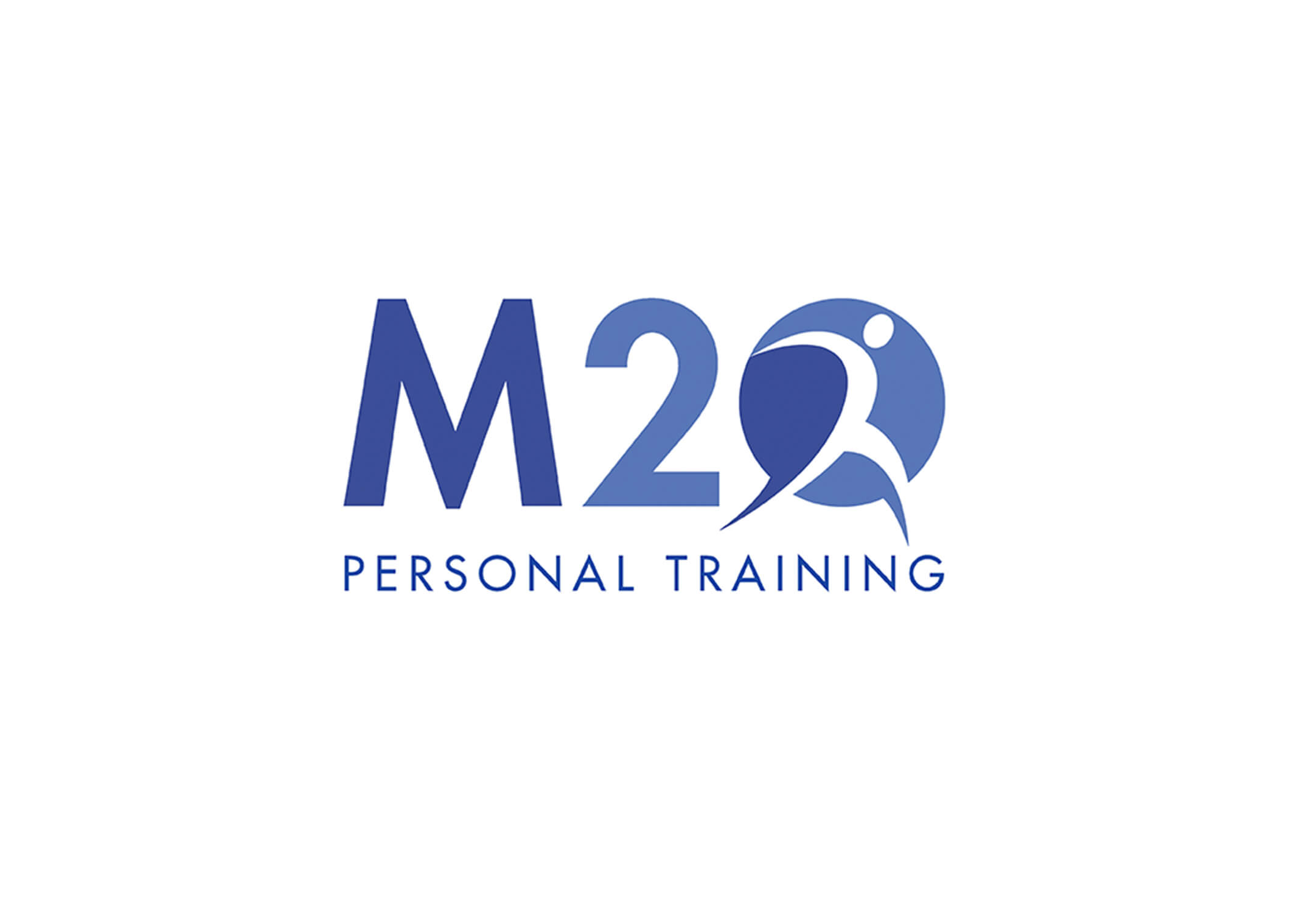
M20 Fitness Gym. Logo designed by me with care to reflect the professional, active and friendly service the trainers provide.
The Pavilion Cafe. The logo for The Pavilion needed to look like a fun, trendy, independent cafe while appealing to all ages as well as the older generation who use the adjoining community centre — the cafe wants to be a place where everyone from the community can come together.
Didsbury Good Neighbours. Designed by me and the talented Katie Beesley for a local Manchester, Didsbury community centre whose aim is to support senior members of the community through a volunteer befriending service and a programme of weekly activities.
Create Construction. The logo mark needed to reflect how this contruction companies design luxury interiors for hotels
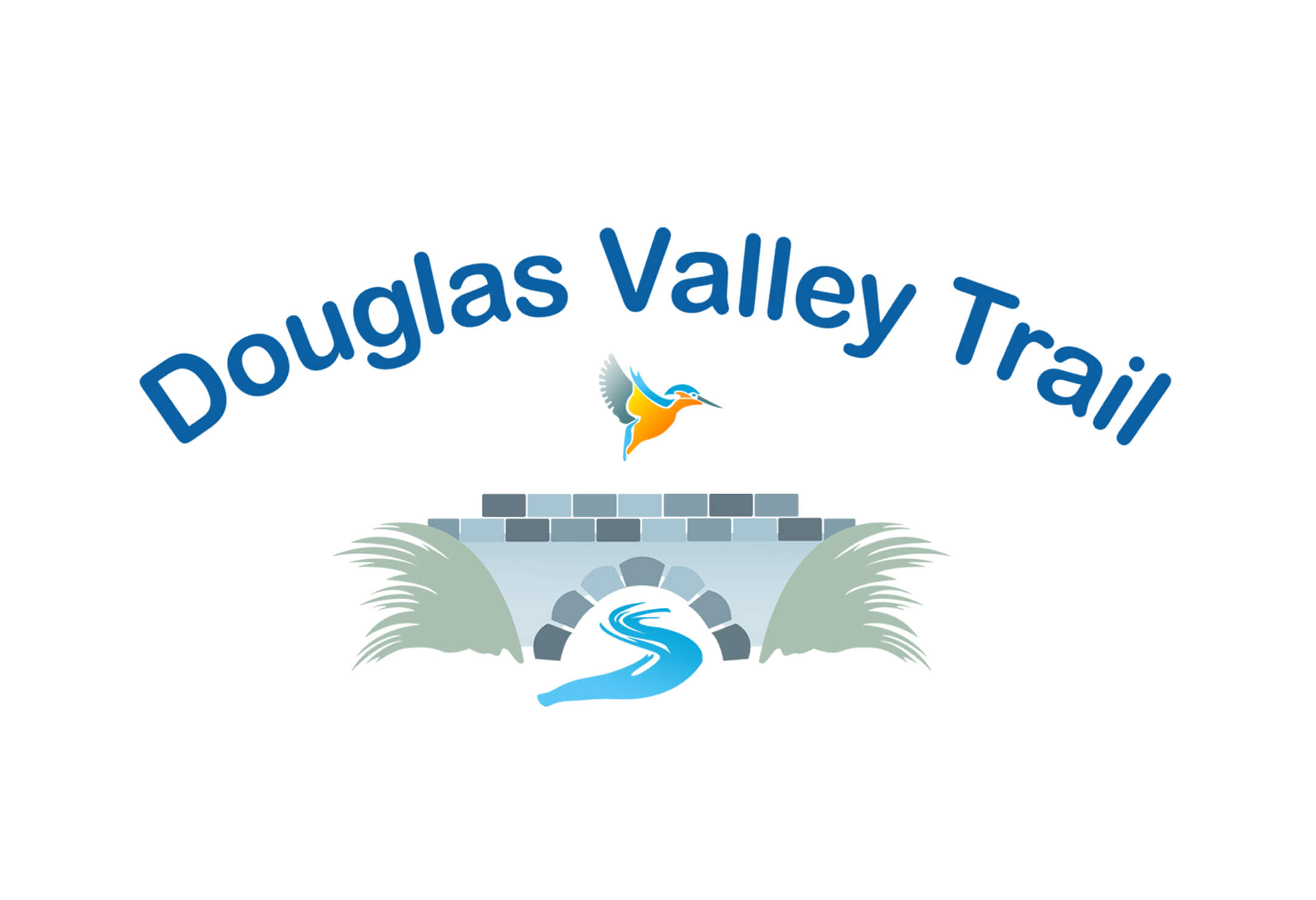
Douglas Valley. The logo was designed by myself while I contracted for Wigan Council. It needed to be friendly and attract families and people of all ages and backgrounds to use the trail.
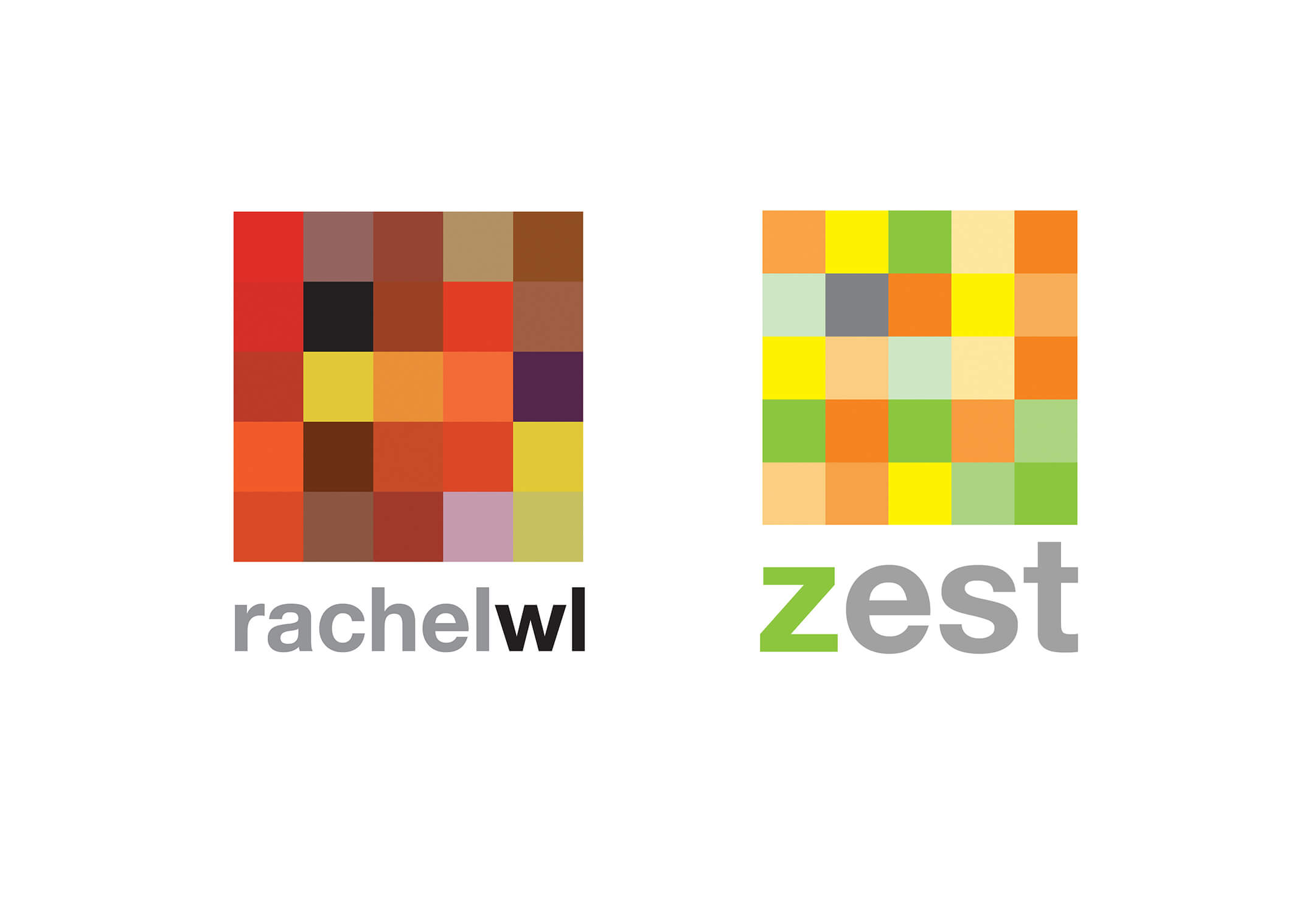
Rachel WL and Zest Business Coach. These logos were designed for a business coach who wanted to reflect the bold and bright attitudes of her clients.
The Naturopathy Room. This was designed to reflect health and vitality.
Santos Soccer School. This logo and badge needed to be distinguishable to set the team apart from the competition. This is why designed this logo to really fit with this teams’ strong and energetic character.
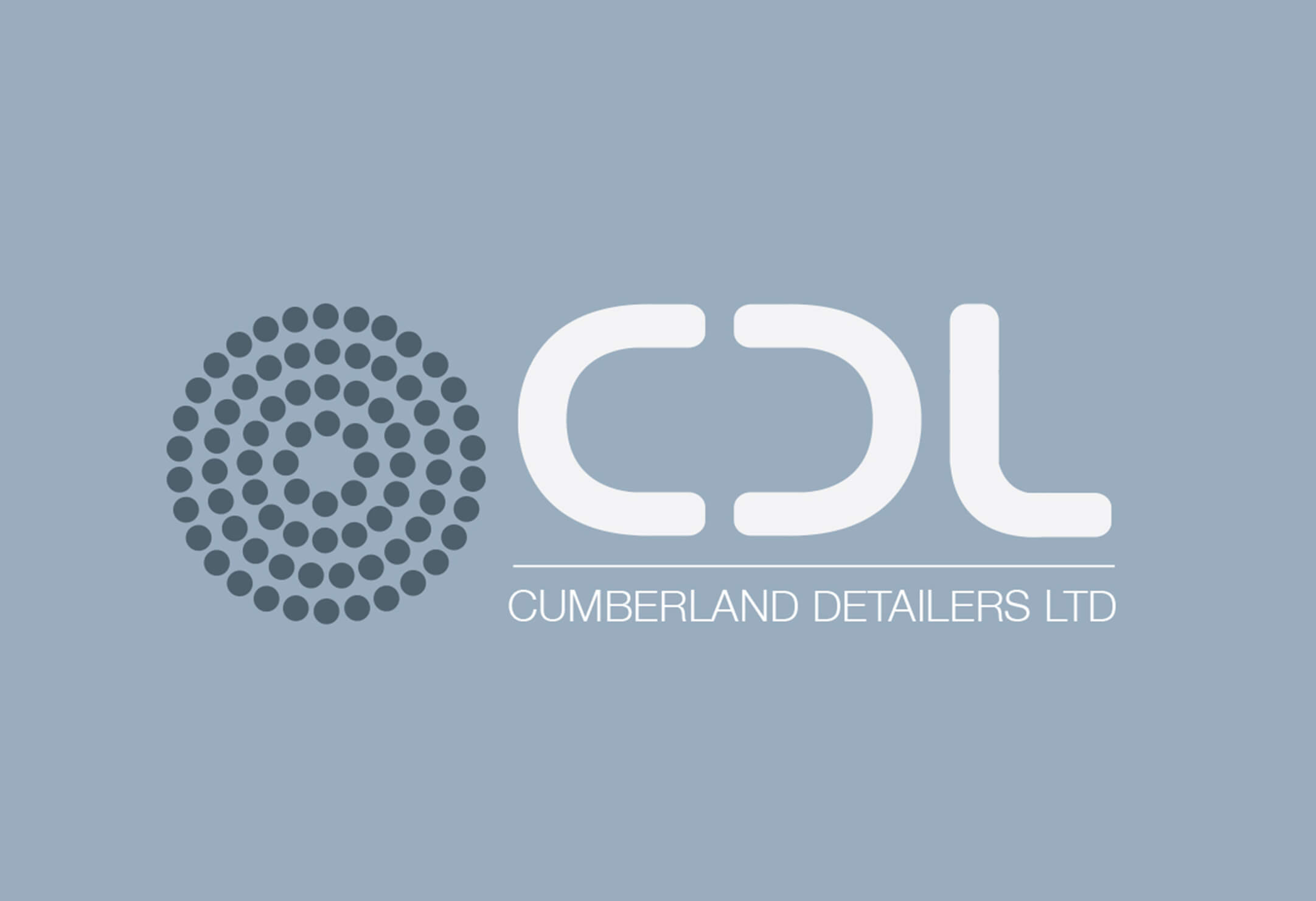
CDL. This logomark was inspired by the rods that that detailers use in their technical construction drawings. The simplicity of this logo means that it will endure the test of time.