


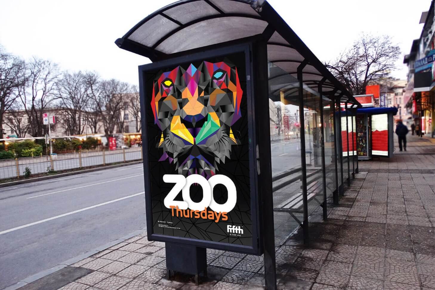
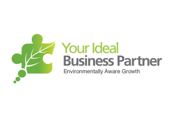


Refreshing a logo design to show how this company improves people lives
The Challenge
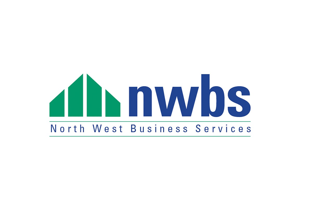
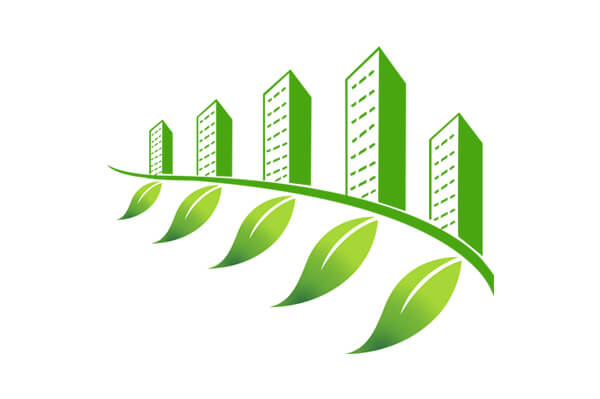
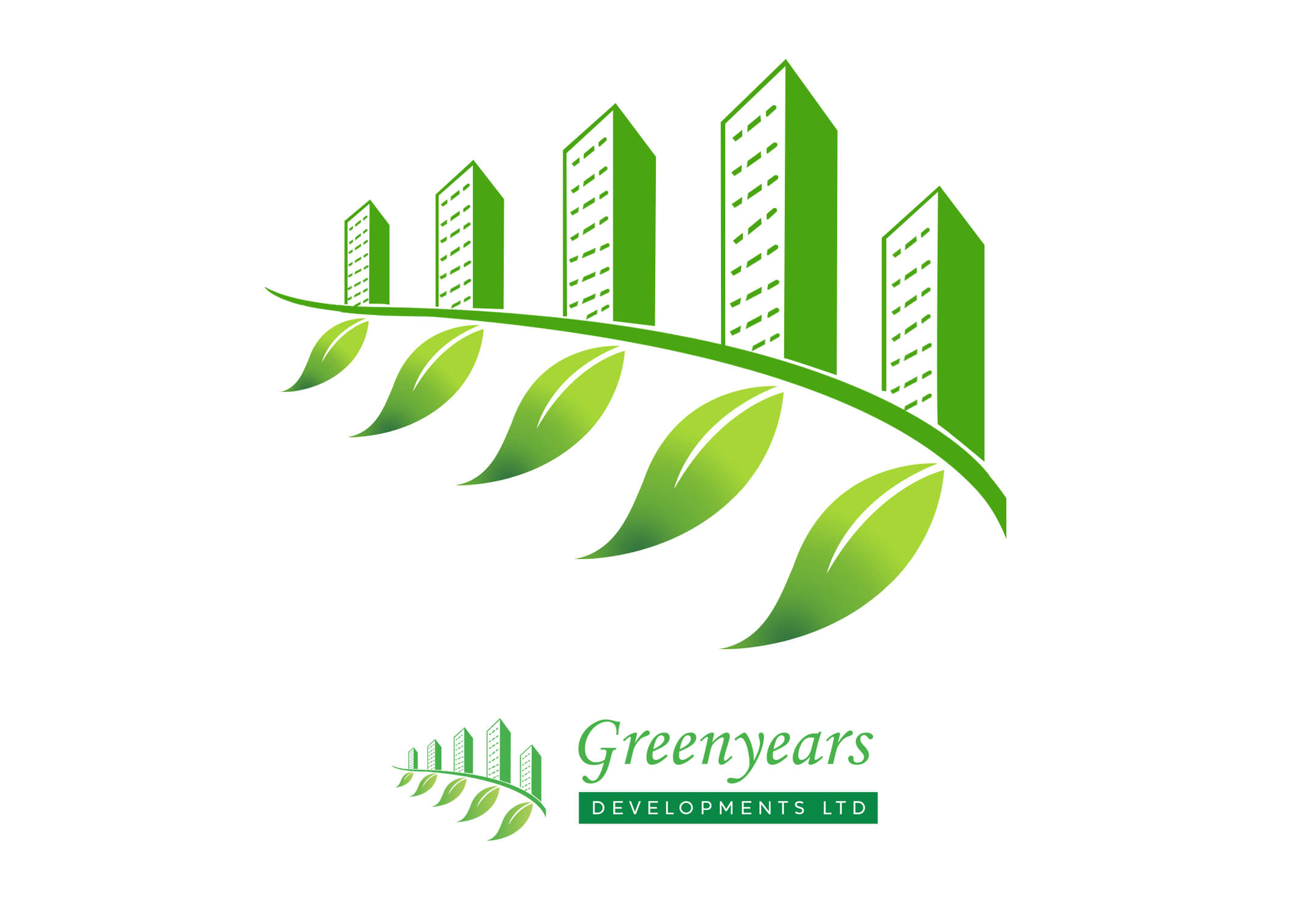
Greenyears Develoment required a logo design to reflect how this real estate company believe in creating green areas around it's developments.
Like all good logos it needed to be distinctive, appropriate, practical, graphic, simple in form, and convey the companies intended message.
The Solution
The shape of the symbol has been kept purposefully simple in order to aid fast recognition and to allow for reproduction at all sizes without loss of detail. The colours are positive, bright and cheery to reflect the companies optimism for including green areas around it's developments to improve peoples lives.
Results
The bright, cheerful symbol reflects the companies optimism for including green areas around it's developments to improve peoples lives.
Feedback
”Suzanne is the most legitimate logo designer I have ever met. Her discovery process is thorough to ensure that she understands your brand so that she can symbolize your identity in a very simple way.
We hired Suzanne to modify our logo rather than create a brand new one, but she has helped us clarify our brand image, which has been imperative for us as we grow and communicate with our customers.
If I ever need a logo designed for anything, I would hire Suzanne again, and I would not hesitate recommending her."
- Greenyears