


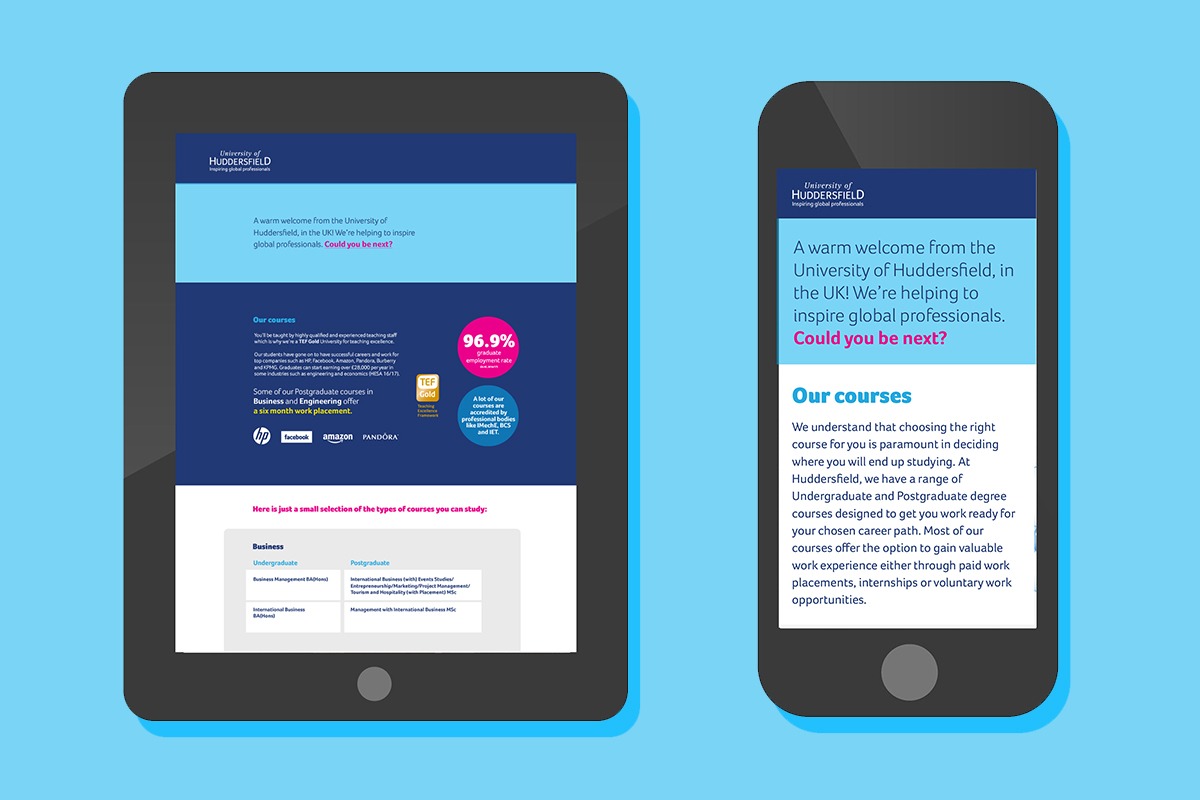


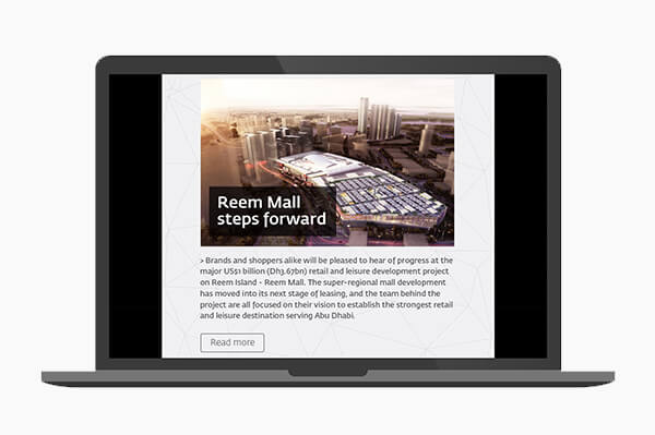
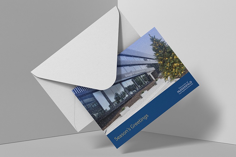

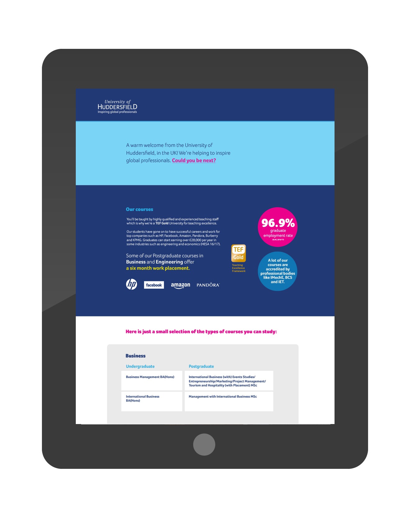
Email design for University of Huddersfield
The Challenge
University of Huddersfield says that 'whatever you aim to do in life, it pays to get a good education. And with high standards of teaching and learning and excellent facilities that's exactly what our students can expect from the University of Huddersfield. Based right in the town centre and at the heart of the local community, we help thousands of people, from school leavers to those returning to education after a gap, achieve their goals each year.'
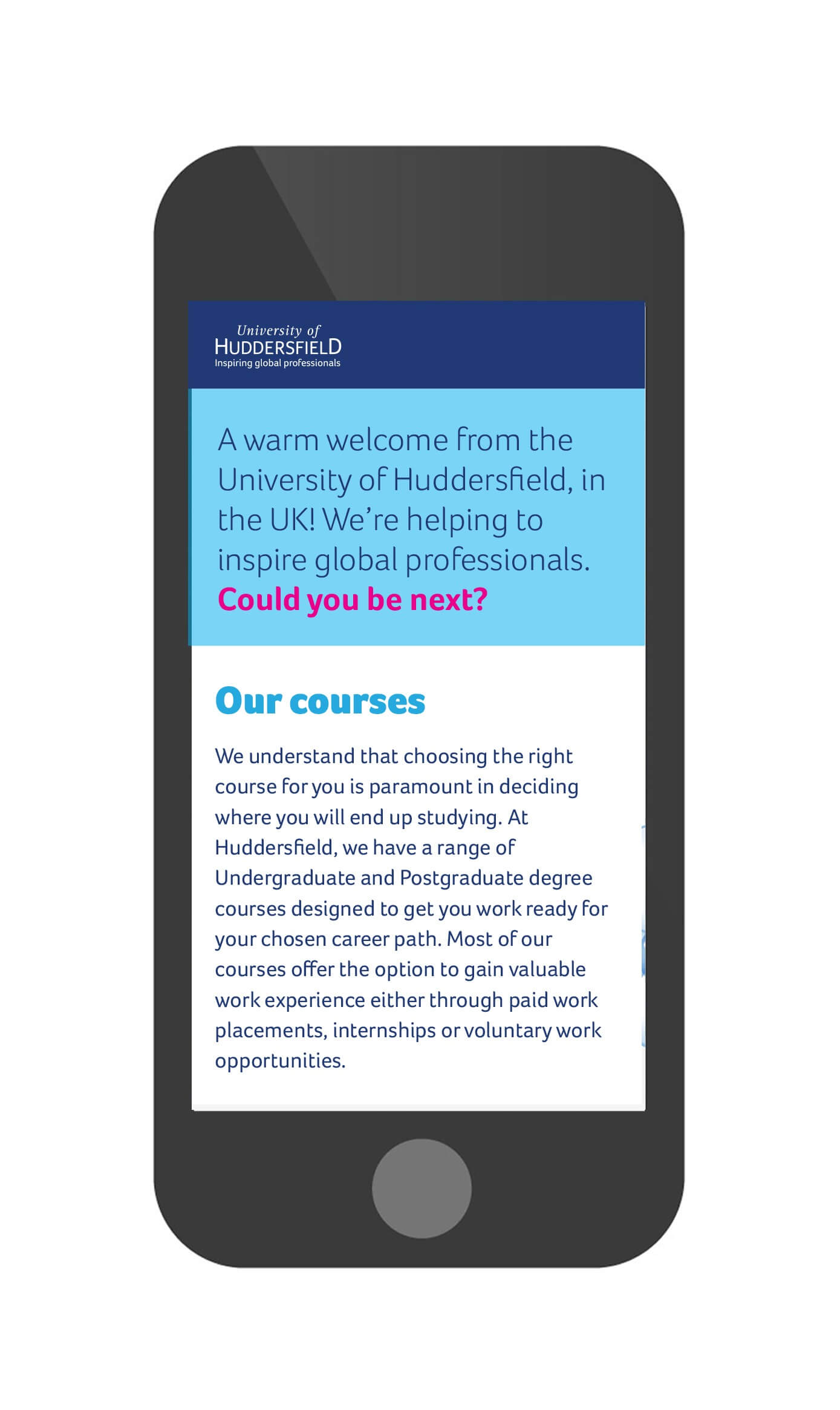
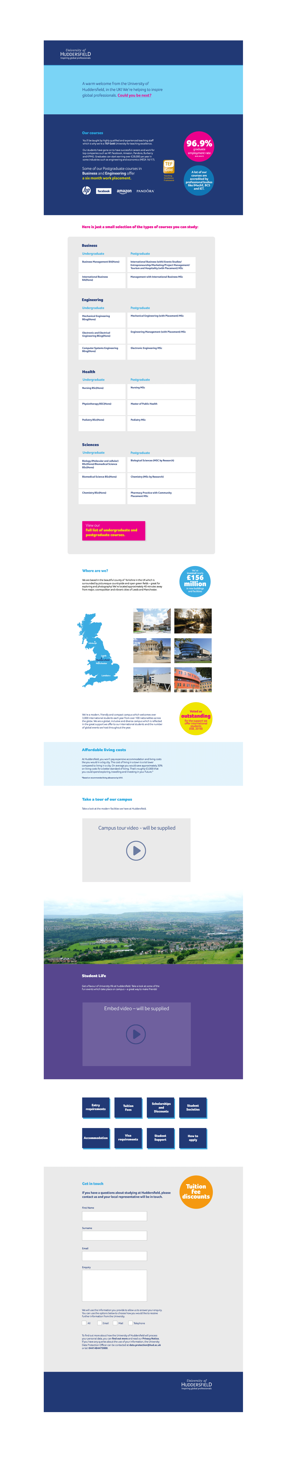
It was my job to design a reusable email template for University of Huddersfield. The design needs to be successful at welcoming and inspiring students. The email must be readable on all devices – tablets, phones and desktops, as well as i0S and Android.
Other considerations:
- They wanted me to look at introducing some more unique features to the pages, to ensure it looks less like a template, and more unique to University of Huddersfield.
- They wanted me to introduce any other “bells and whistles” that improve the user experience.
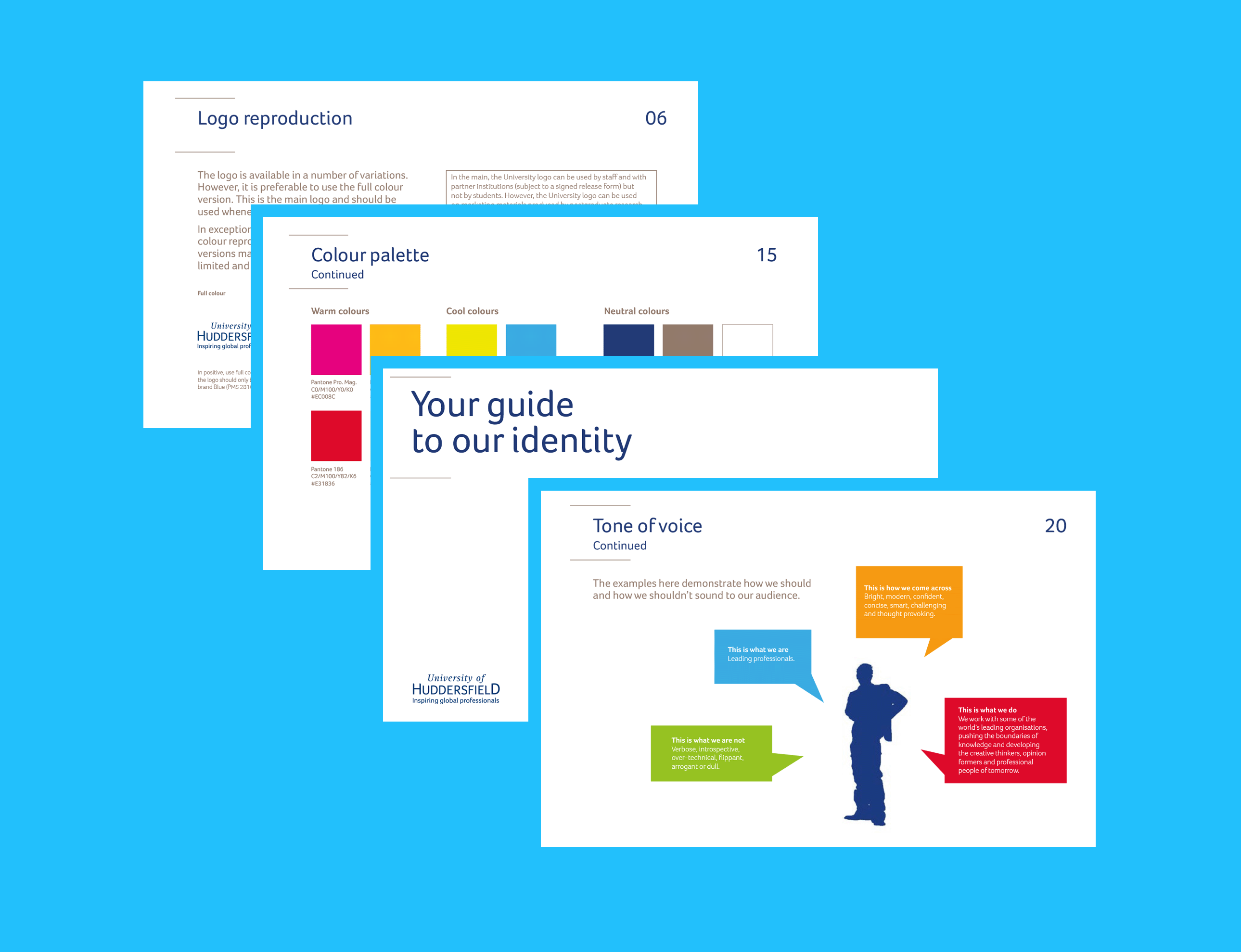
- I had to adhere to brand guidelines and use the University of Huddersfield font wherever possible using the light and heavier versions of it. Brand guidelines were provided, some example pages shown far below.
- They suggested that I think about incorporating photography, icons and diagrams similar to what is being used on their website.
- Website: https://www.hud.ac.uk/
The Solution
- The email starts out with a dynamic stapline which grabs readers' attention.
- The design of the email is clean and contempory, thanks to a brilliant use of negative space and attractive fonts.
- There is consistent use of colouring, especially the signature blocks of brand colours and fonts.
- Short attractive text in highlighted circular blocks that communicate statistics and information to get the audience interested in reading more about it.
- Since people use different email browsers on desktop and smartphone use has skyrocketed this email needed to be mobile friendly and display optimally between a desktop/laptop ensuring that it will look great regardless of where subscribers read it. It’s very unlikey thay the user will be able to open a background image or the background may stretch and lose its quality, which will ruin the design of the newsletter itself, therefore I kept the background design white with no image.
- The emails were tested thoroughly on all devices and clients.
Results
The design rendered beautifully across all email clients and on mobile devices. The email welcomed students, helped to inspired them and gave important information in a clear, interesting and concise way.