27th January 2019 - No Comments!
The process of designing a timeless visual identity for the Medical Practitioners Tribunal Service
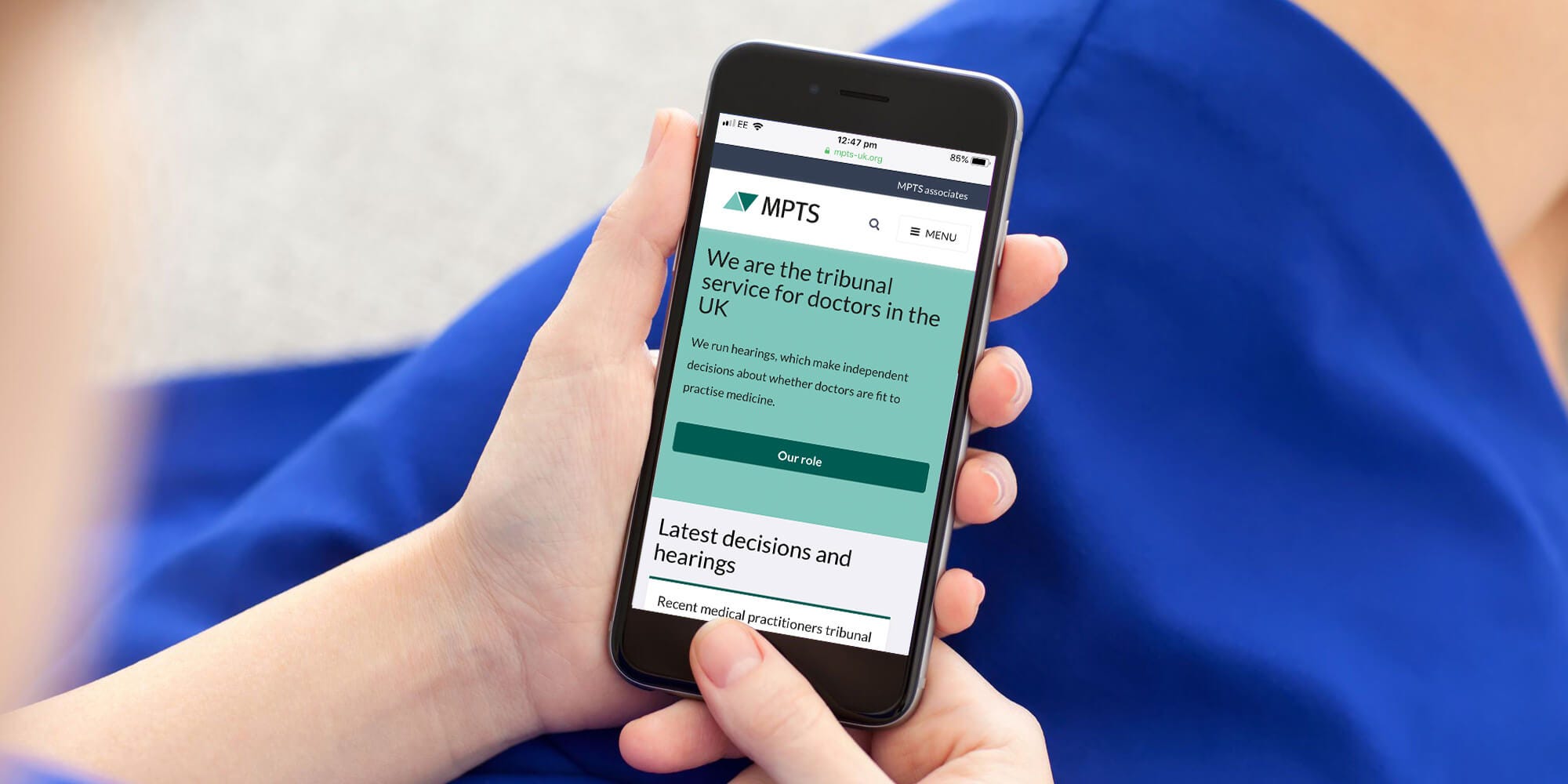
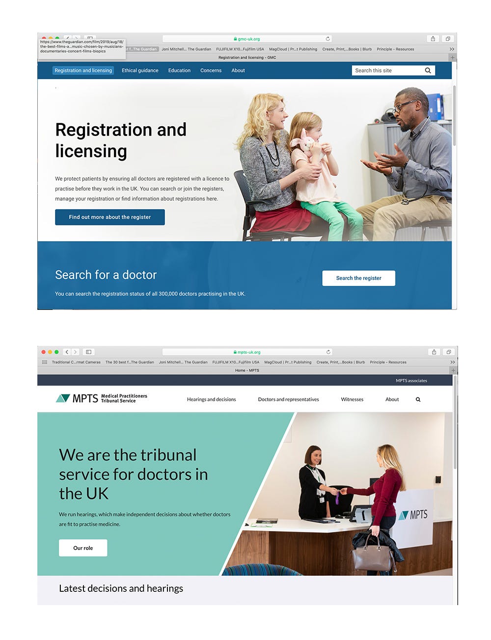
Medical Practitioners Tribunal Service is a tribunal service for doctors in the UK. They run hearings, which make independent decisions about whether doctors are fit to practise medicine.
Their vision is to provide a modern medical practitioners tribunal service that is effective fair and impartial. It is a service that makes high quality, well-reasoned, independent decisions to protect the public. Runs hearings efficiently and effectively, using resources appropriately. Treats all tribunal service users with respect and fairness. Has a distinct voice, clearly articulating their role.
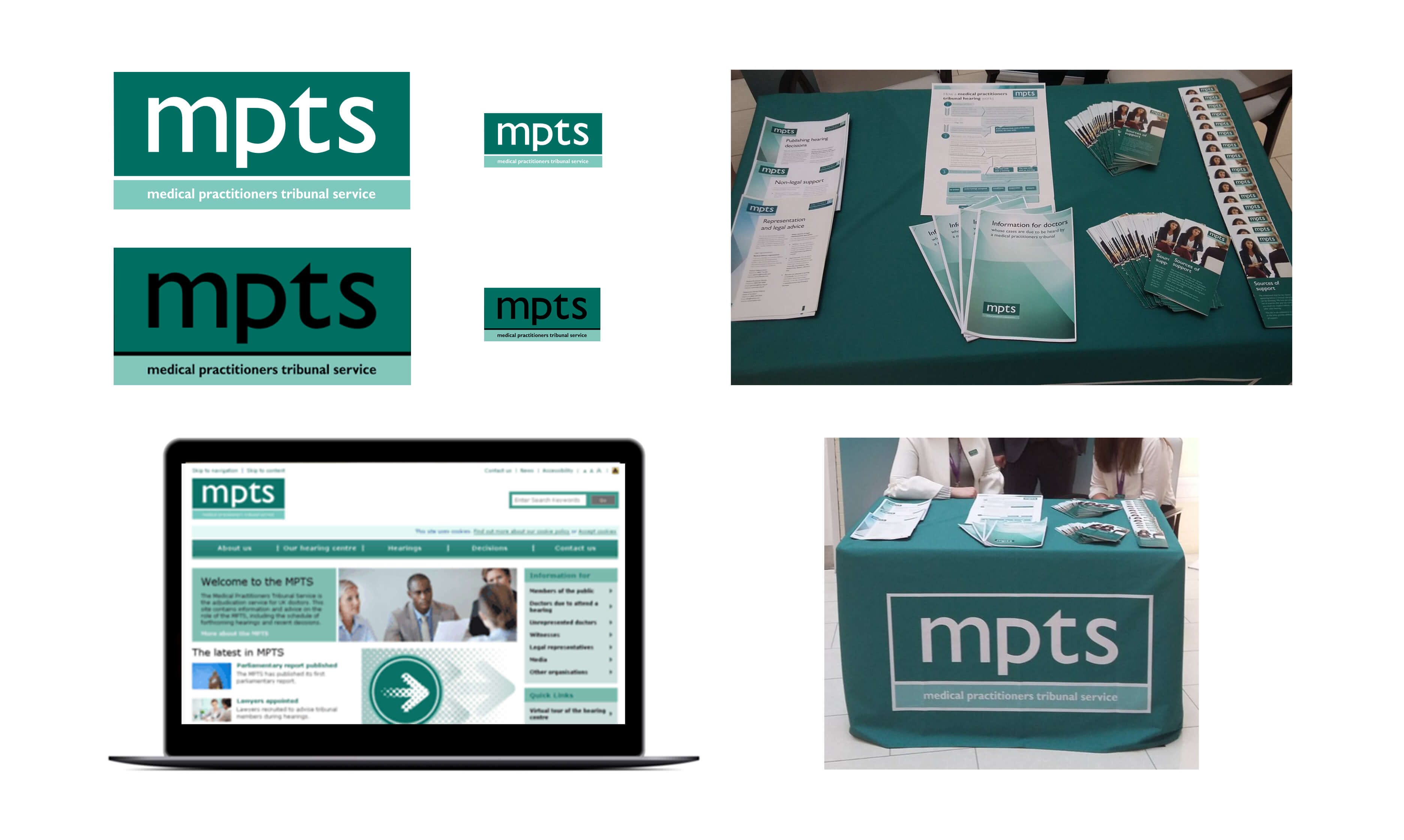
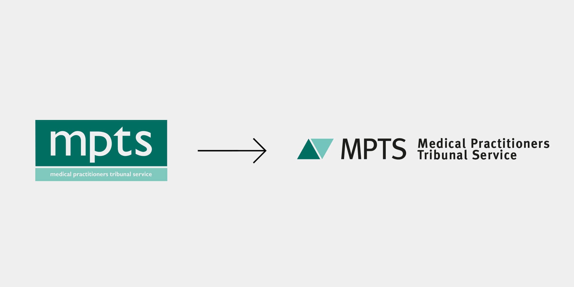
The MPTS had a logo that contained small text that is hard to read. It had no flexibility and didn’t work digitally. They also had a colour pallette that was limited and flat. Overall their visual identity was not distinctive enough.
While I was contracting at the The General Medical Council as part of the Digital Transitions team it was up to me to design a new visual identity for the MPTS along with a set of identity guildlines, front end pages for the MPTS’s responsive website and show how the logo design would work on signage, exhibition banners, hearing documents and powerpoint templates.
Background — the MPTS visual identity before the refresh
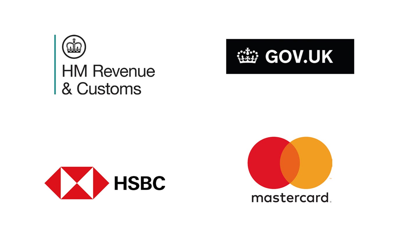
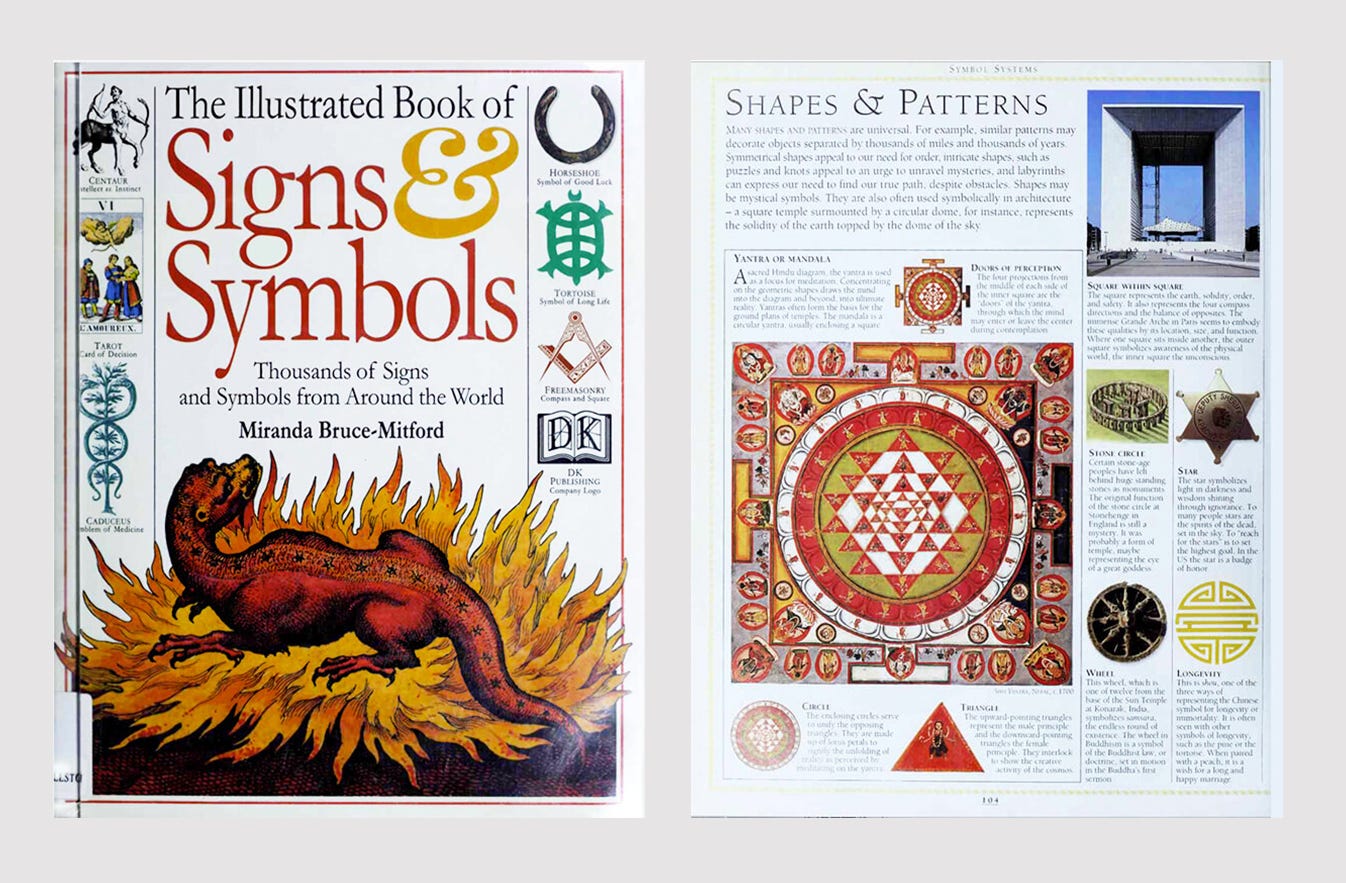
Research — trademark designs of law related companies
Research — websites of law and health related companies

Examples of modern respected company logos that were designed for digital media
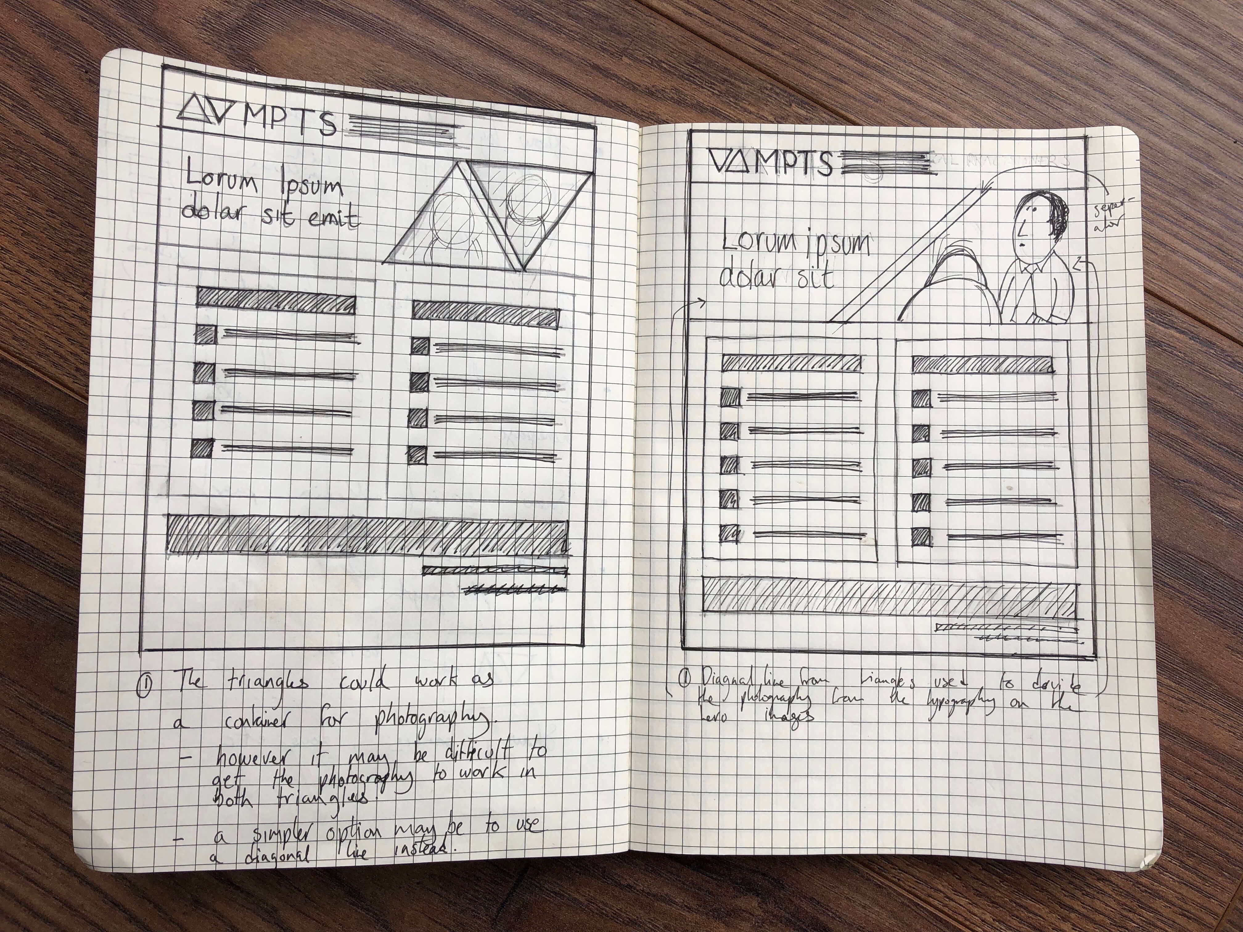
To achieve the goal the first questions I asked myself is whether the client and their design problem requires a symbol (an icon or graphic image that appears with the name) or simply a memorable typographic treatment of the name (called a “wordmark” or logotype”). In this case I decided that a symbol would work best because the name of the organisation is so long and would need to be used because the general public would not recognise the initials ‘MPTS’ on its own. I felt that a symbol could also work as a decorative shorthand that embodies the visual identity and that could unite future subdivisions under a single identity system.
Ideas and Concepts
In this supersaturated visual environment, the essential characteristic of an effective trademark design-to endure over time and thus fix an identity in the mind of the public-is even more meaningful for a company or organisation. Defining these logical parameters the eventual solution lays the ground for the creative work to come.
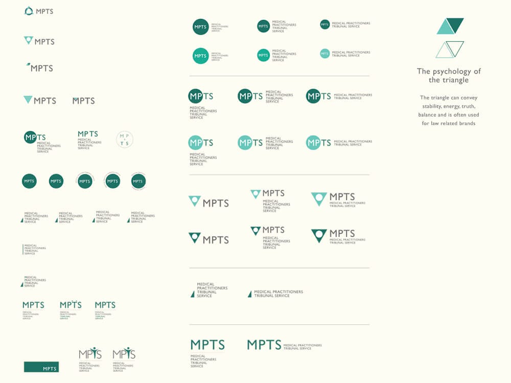
Generating logo ideas
This is where the science-which is everything my team and I learned from identifying the main needs of the organisation and the strategy that grows from it-meets the art, which is the intuitive exploration of conceptual design solutions. In this phase thoughts and feelings take form.
I sketched my ideas by hand-using pencils, pens and then digitise them on the computer. Sketching by hand gives a designer immediacy of artistic expression and intuitive extension of creative impulses that the computer lacks. I look for the most direct connection between an idea and the creation of a form.
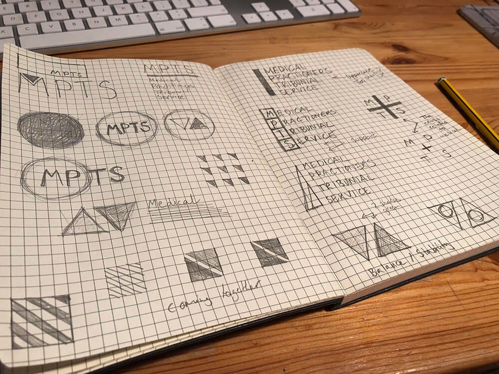
I selected the most promising design alternatives to present to my team as there is rarely a single right answer and then we chose one of these to be presented to the client.
Experimenting with website homepage ideas
Creating a colour tone and photography mood-board to influence the photoshoot

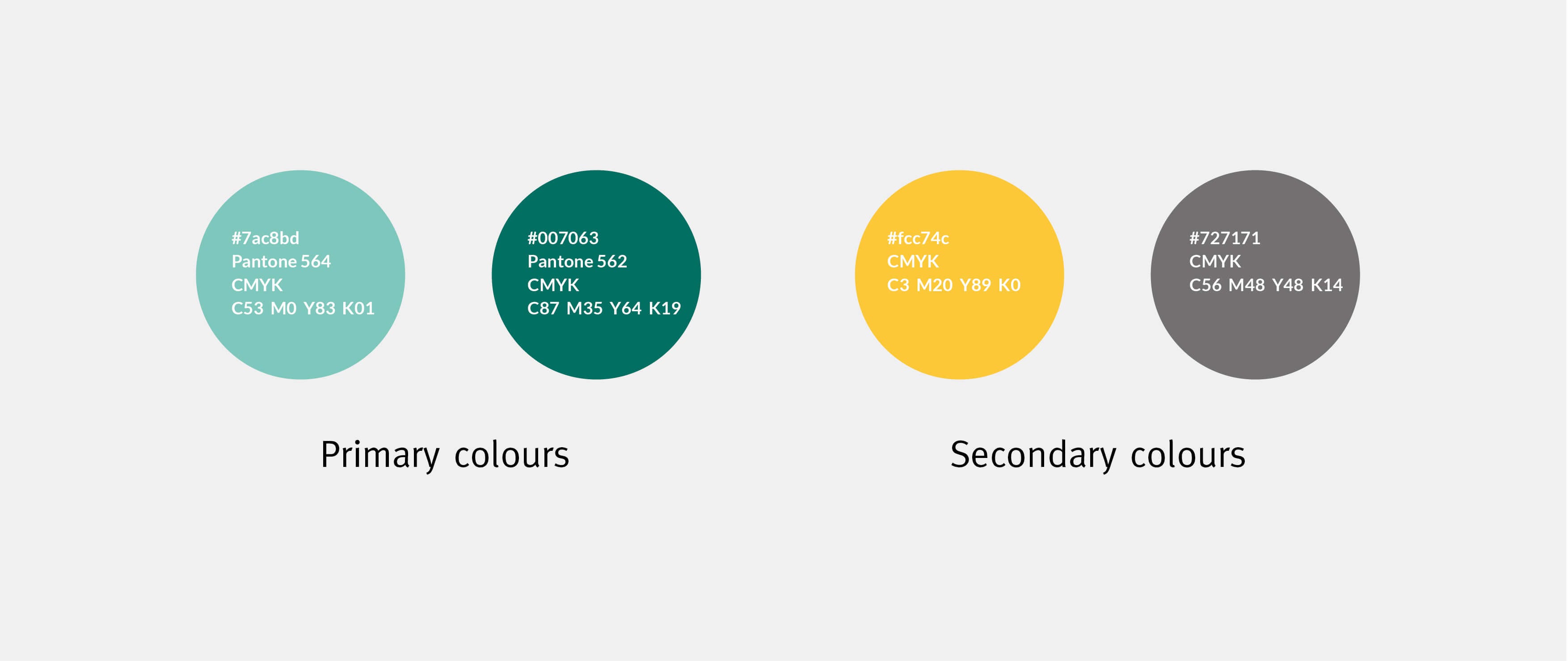
Expanding the colour pallette
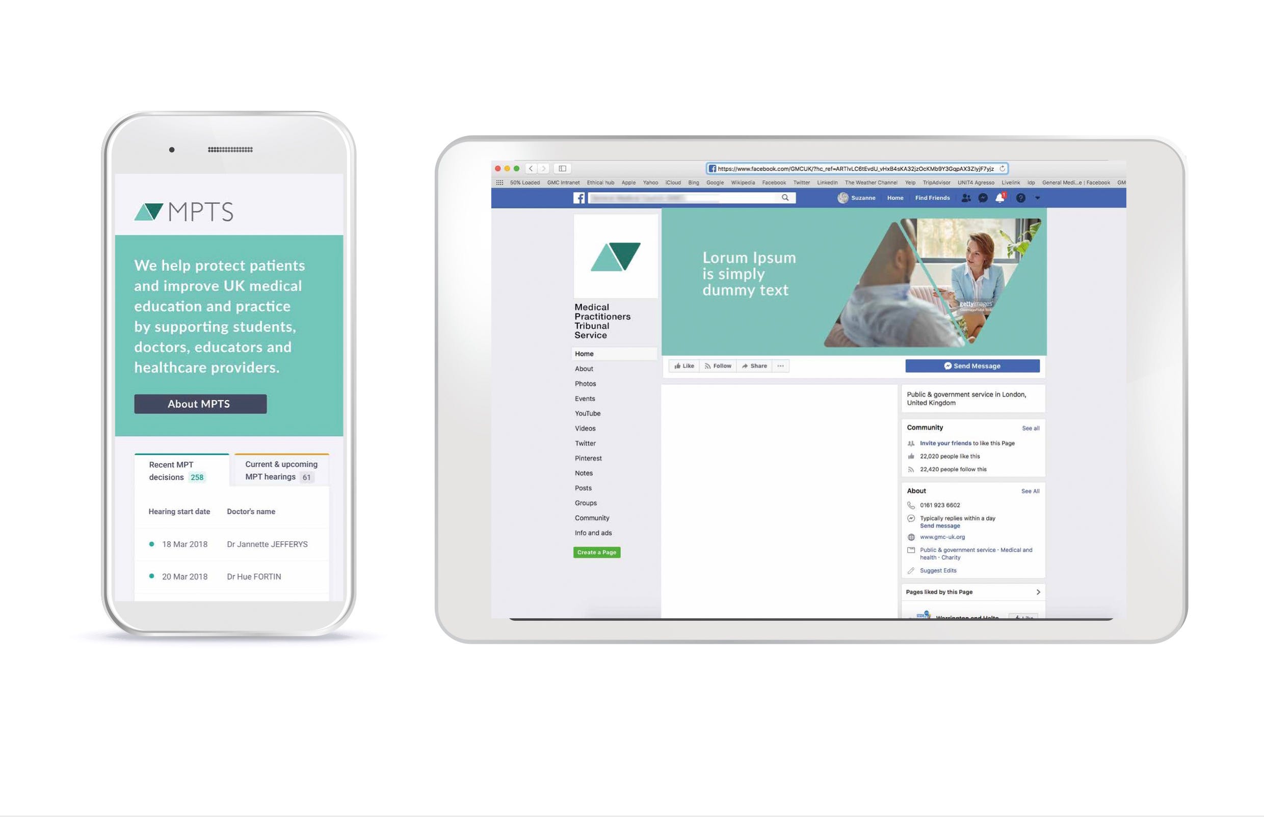
Looking at how the logo icon works digitally and responsively

Works well small as a favicon

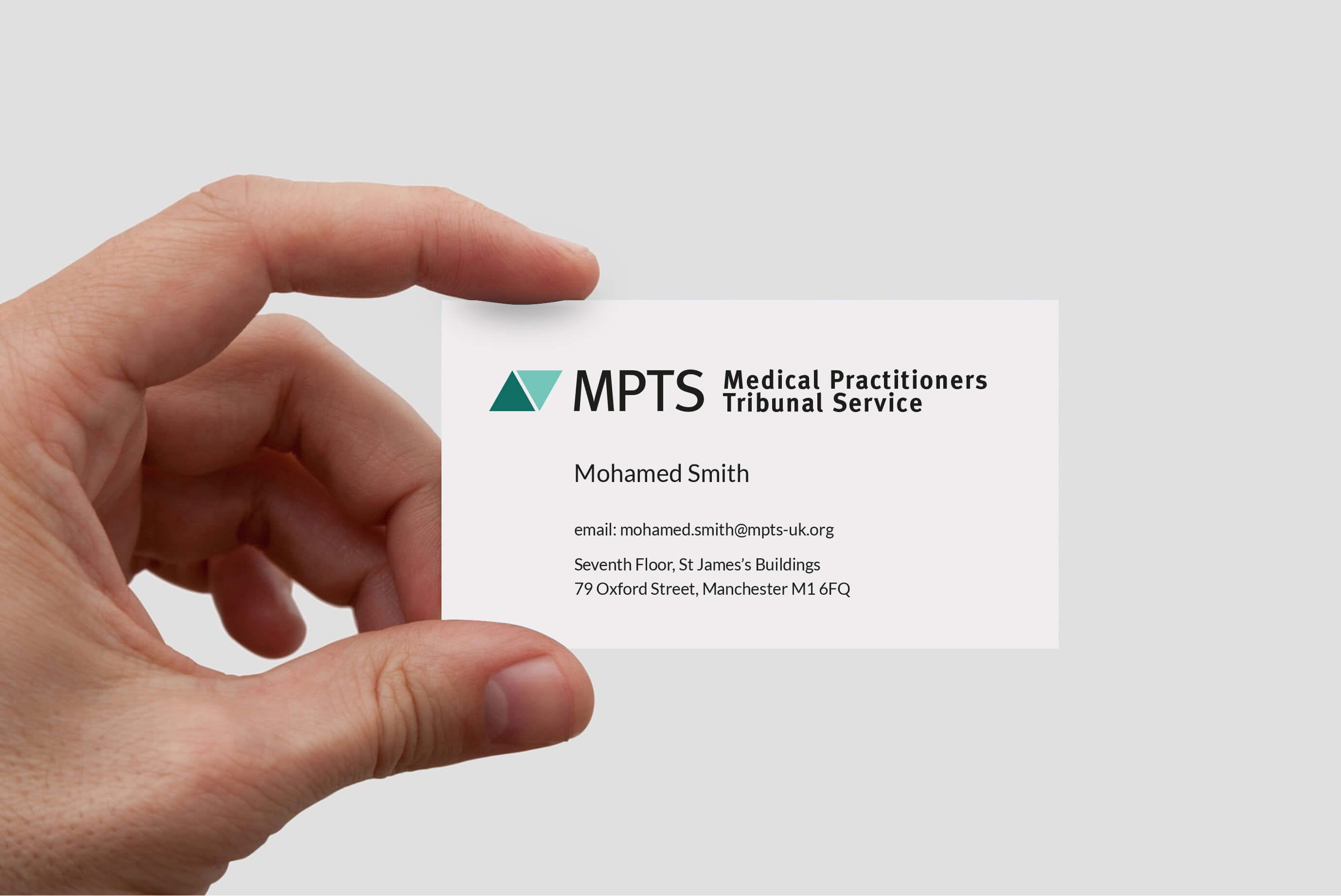
Looking at how a logo that’s designed specifically for digital can still work for print materials
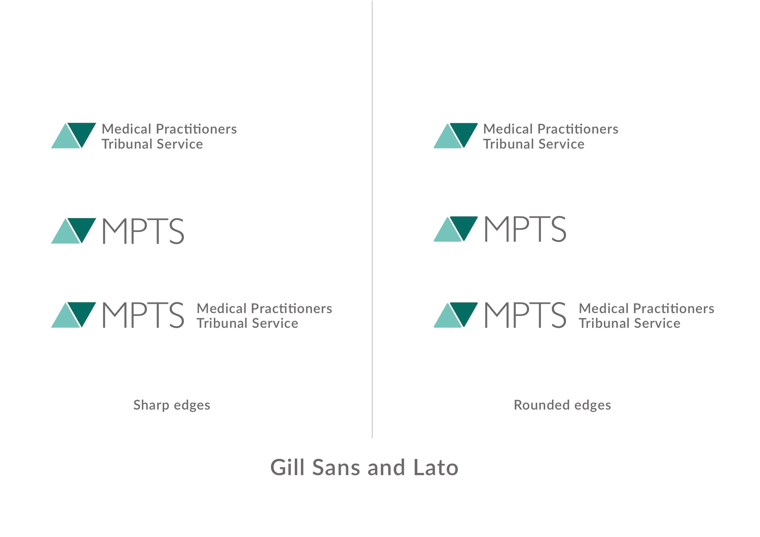
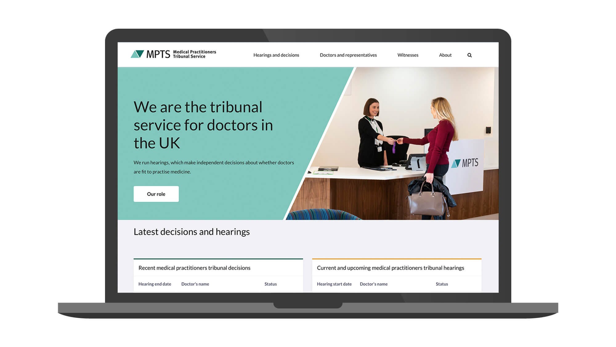
The final logo icon design
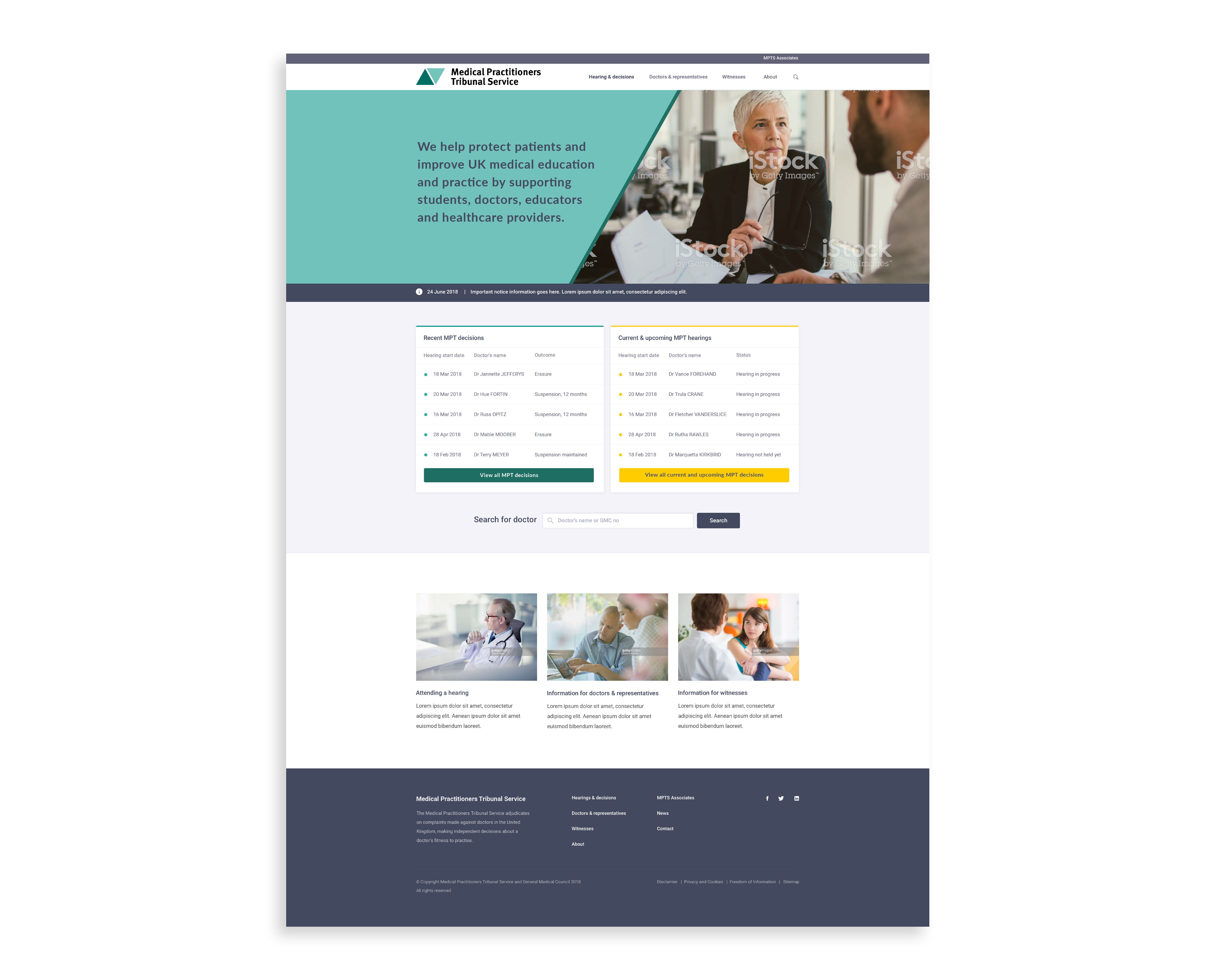
The final website design
Identity design is not about what one likes or dislikes. It’s about what works. Personal preferences for colours, shapes, or styles do not prevail. Therefore, I judge each of my early design concepts by following criteria: Is it appropriate? Is it simple? Is it memorable?
Most of my team felt that it worked well and when presented to the MPTS at first they were a little shocked at how different it was from what they had but when we explained the reason behind the symbol, they got it. I felt that this logo has the potential to endure: it is relevant to the client and can be used flexibly and consistently, so it doesn’t need to be changed in the foreseeable future. It is simple enough to be to read in an instant and memorable enough to persist in ones mind.
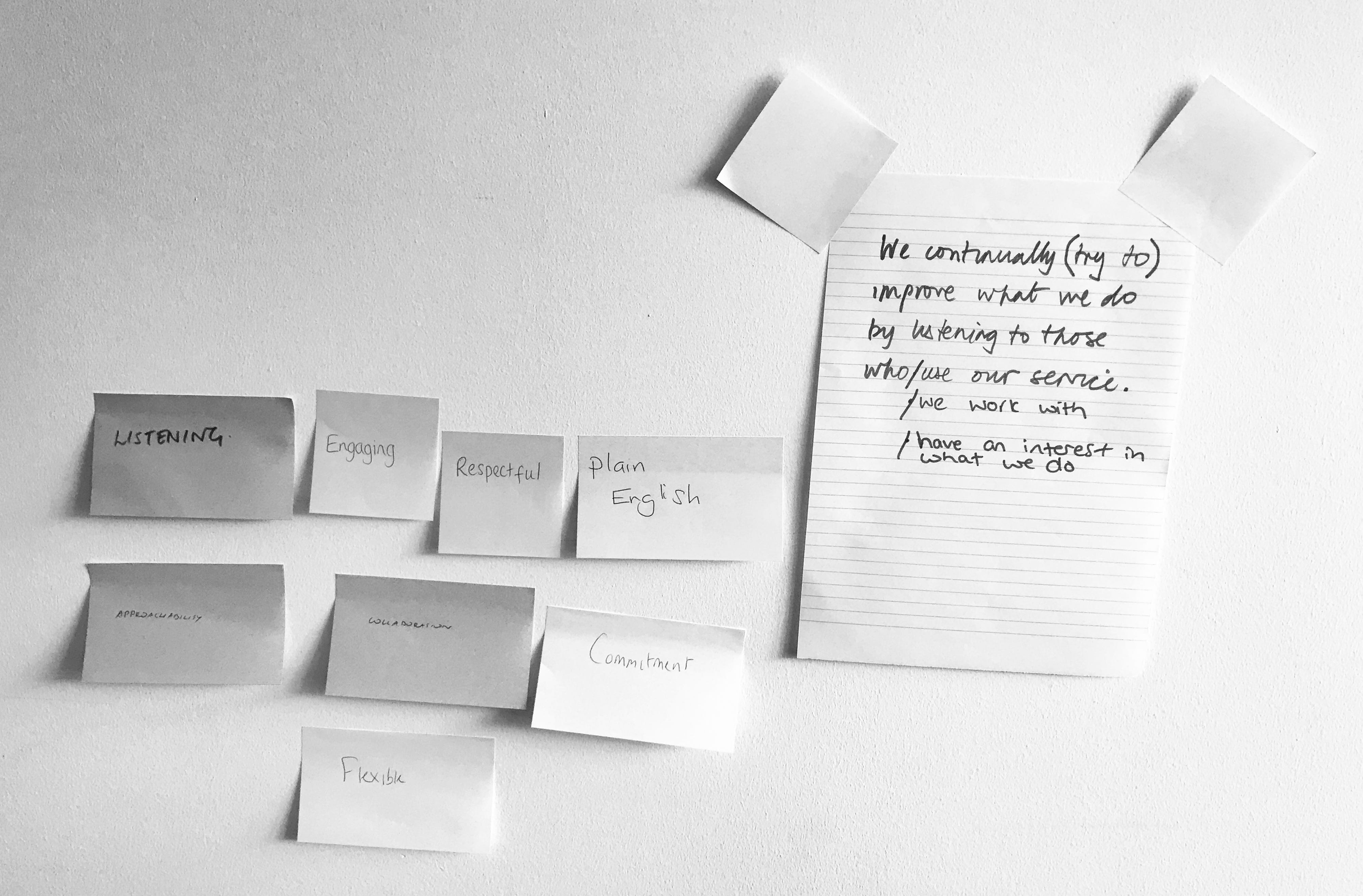
Discovery workshops with the lawyers at the MPTS
I assisted in facilitating a workshop that helped the lawyers at the MPTS think about how they would like the MPTS to be perceived by doctors, witnesses and the general public. We also presented the new visual identity design to see if it reflected how they felt.
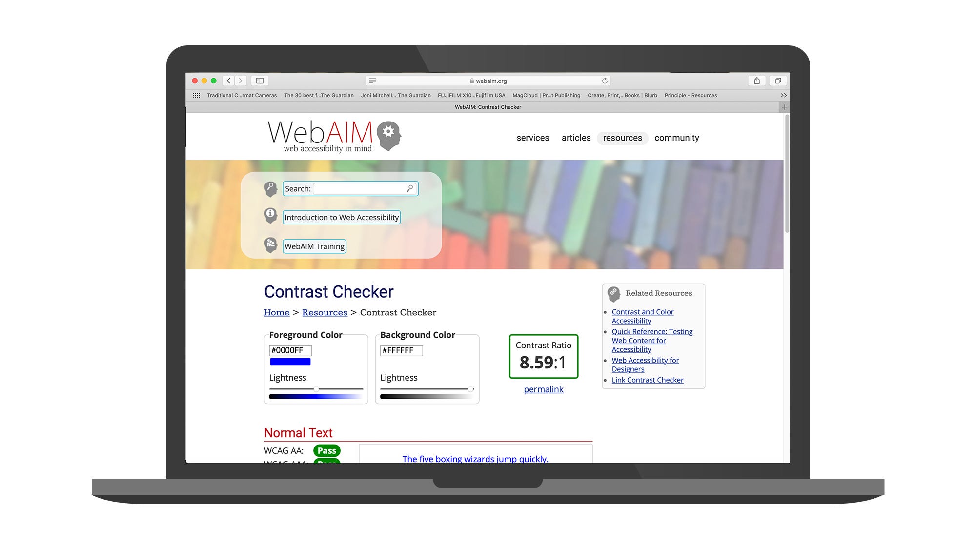
Testing for accessibility using WebAIM
Testing with a focus group of doctors
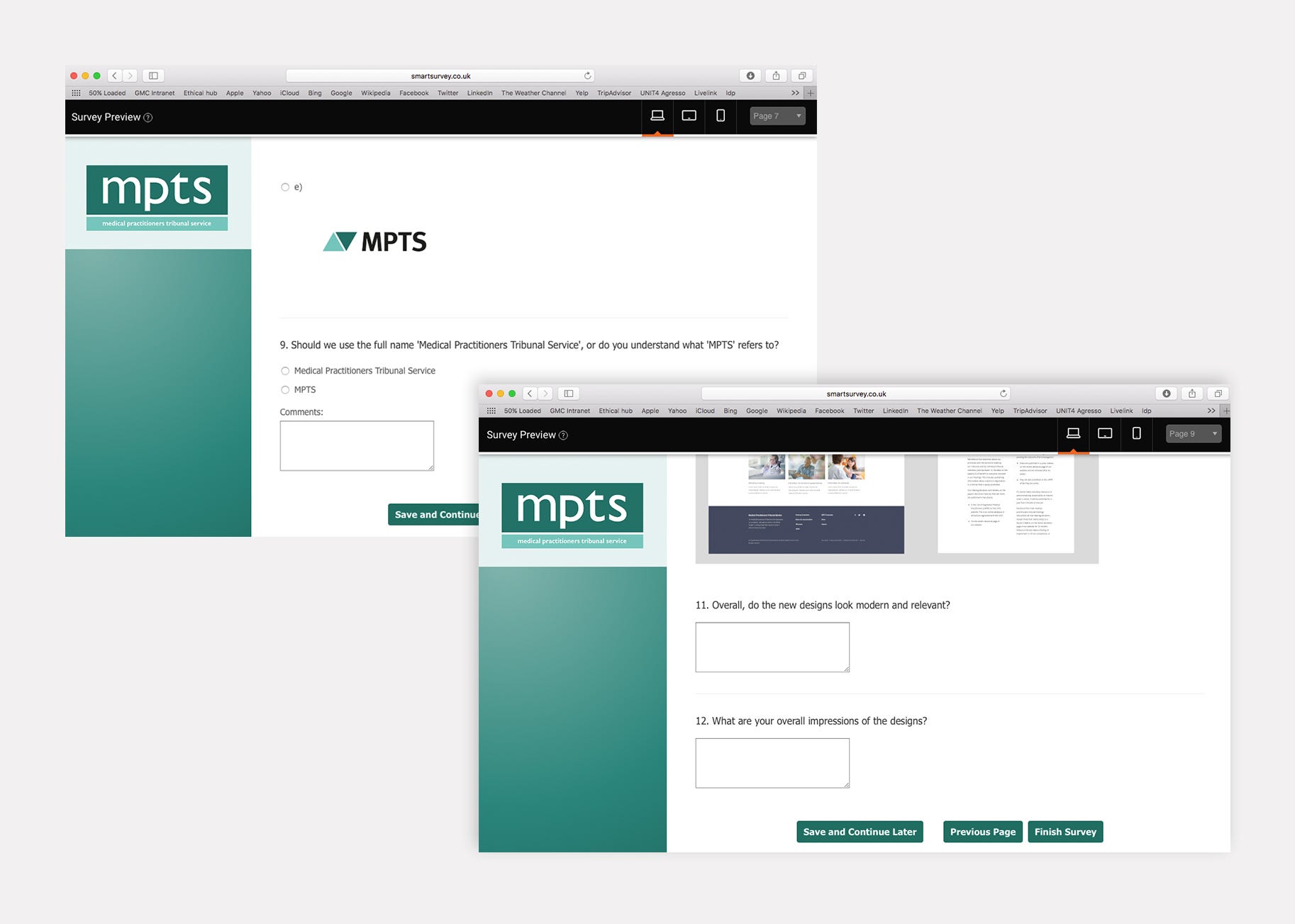
The logo was also subject to rigorous testing by focus group. This provided valuable input since trademark design requires considerations other than immediate, subjective reactions.
It is only after a mark is officially adopted that the public will embrace it and with time come to associate it with their feelings about the company or institution it represents. Like a good red wine, a trademark needs to mature, so evaluating it in concept form requires the judgement of an expert verse in assessing functionality.
How the visual identity design of the related General Medical Council website and MPTS website differ from each other
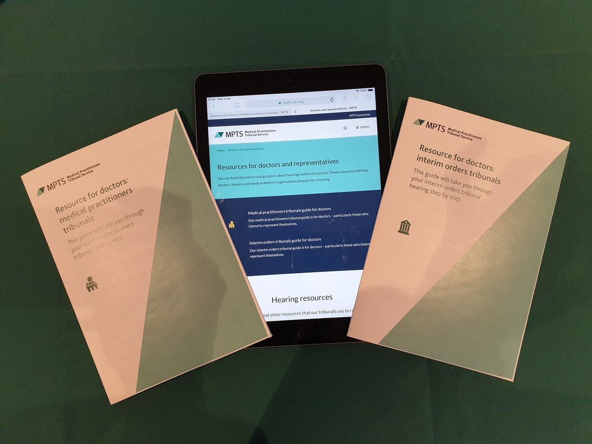
I then applied the designs to communications relevant to the client, such as stationery, law documents, website, exhibition banners, signage and mobile devices. This allows my team and I to judge which concepts are the most effective in identifying the entity consistent. As we apply the design concepts, we develop a distinctive colour palette and typographic style-a comet visual language that compliments and helps accentuate the trademark logo design.
My team and I shared the designs with the clients only the solutions that can work effectively for them. We presented these designs shown in applications. In conversation with the client, who knows their own field best, we review the advantages and disadvantages of every solution and arrive together at a preferred design.
The result of the disciplined but creatively open process described here. All were presented to and ultimately adopted by the client.
The approach practiced in this case can produce trademarks that endure ending level of public awareness-indeed that can become iconic. Hopefully this helps this process become more widely understood.
My designs being used by the MPTS and influencing in-house designers

How the new MPTS logo was elegantly animated by a supplier

“We’re very happy with it — glad you convinced us about the triangles.”
- Medical Practitioners Tribunal Service
You can check out the case study on this project and more of my design work here:-
http://www.suzannemurphy.co.uk/work/mpts-visual-identity/